VA eHMP · Designing for Hour Eleven (2015-2016)
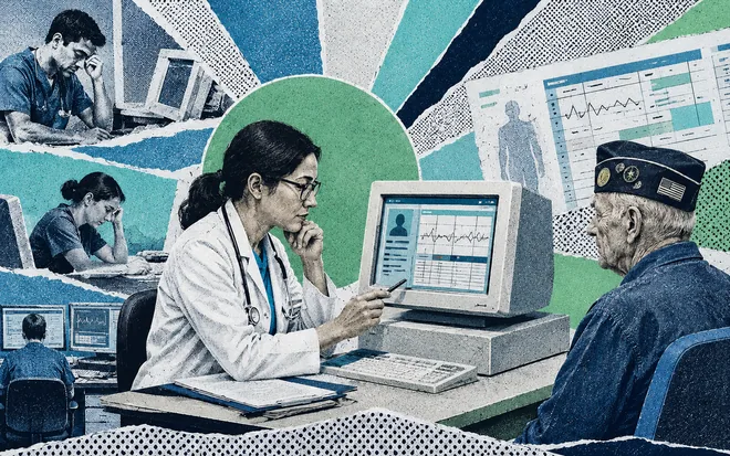
Make it less heavy on the eyes. That was the ask, and it reads like a styling ticket, the kind that gets cut the moment the schedule tightens. But VA practitioners read patient charts for twelve hour shifts, and at that exposure eye strain stops being a matter of taste and turns into a clinical risk. I made that the argument, and it changed what the project was allowed to cost.
The Veteran Affairs eHMP was a three stage project to renew the user interface of the Electronic Health Record and the Practitioner Workspace used across VA facilities. I was at Accenture, formerly Agilex, leading the visual design of it, and it is still one of the products I am proudest of having worked on.
TL;DR
- The VA needed its Electronic Health Record modernized: many medical systems folded into one application, brought to contemporary standards, built around human centered design.
- Under a year to do it, HIPAA and 508 compliant, on screens dense with information somebody makes emergency decisions from.
- The ask to make it "less heavy on the eyes" was filed as cosmetic. I reframed it as patient safety, because a tired practitioner misreading a dosage at hour eleven is not a styling problem, and that reframe made the work non-negotiable.
- With that clock, building a visual language from scratch would have been ego, not strategy. I surveyed the UI kits on the internet, bought the one that translated to medical software, and spent the time saved on density, hierarchy and fatigue.
- We didn't hand off comps. We executed the HTML, CSS and JavaScript ourselves, so the design and the shipped screen were the same artifact.
- The work earned the accreditation for the project re-compete, a contract worth almost 300 million dollars for Accenture.
What they were staring at
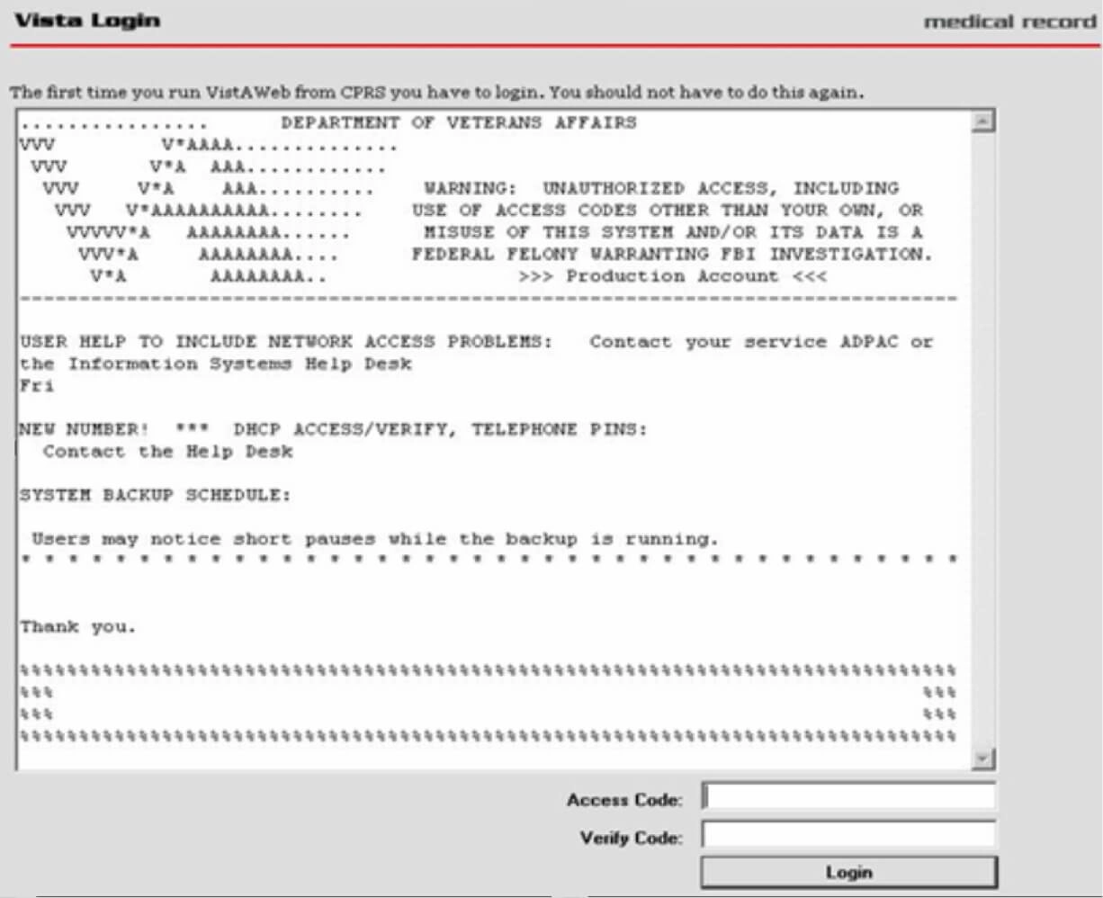
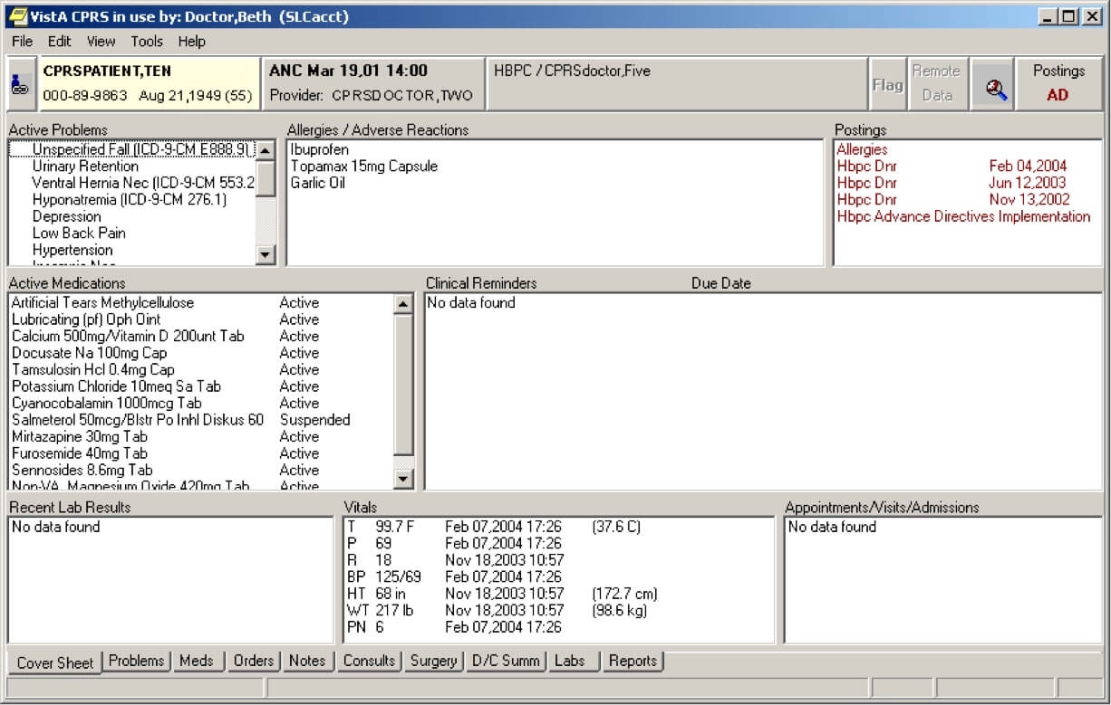
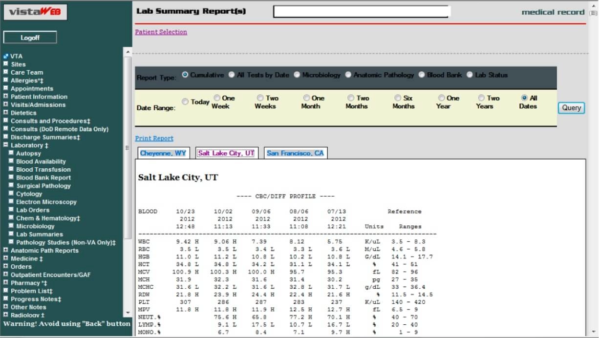
This is CPRS, the client the VA had been running on VistA for years. It kept veterans alive for a long time and it deserves the respect, but look at it honestly: grey on grey, everything the same weight, information density decided by whoever had the last feature request. An OCD nightmare, and worse than that, a screen that gives you no help at all deciding what matters.
My starting point
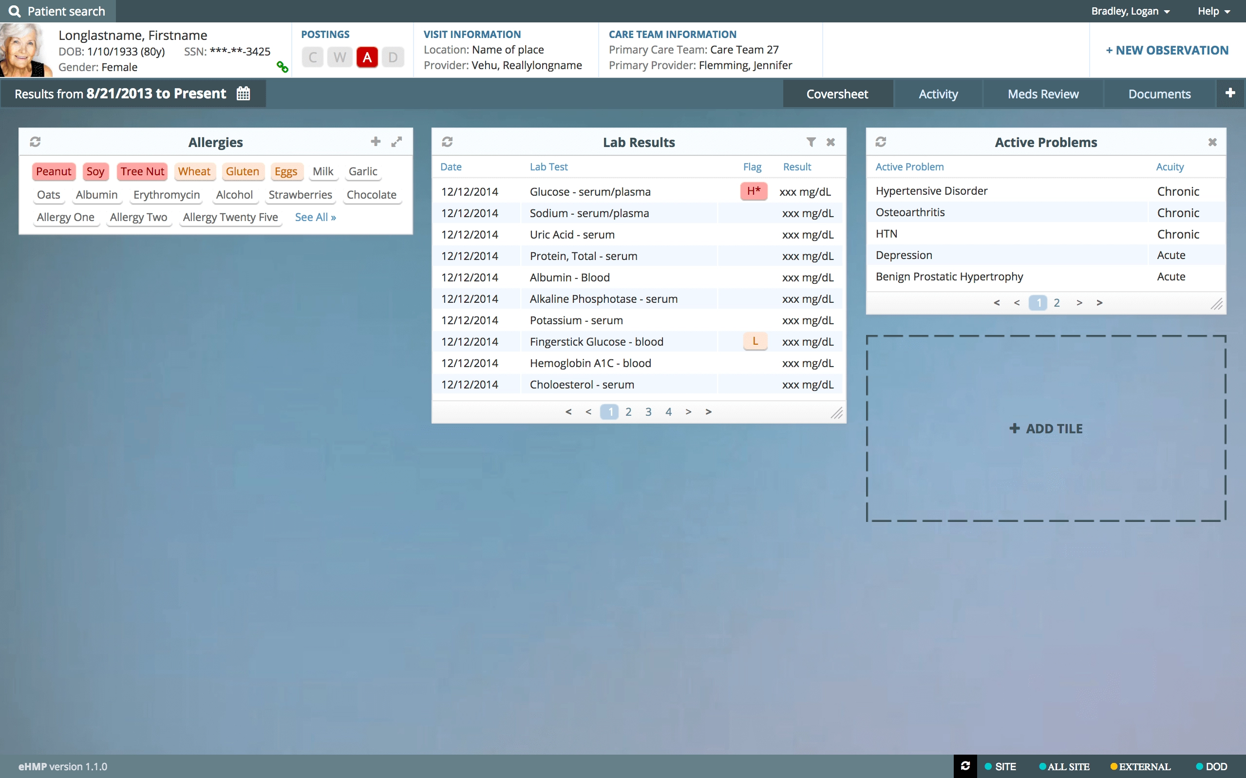
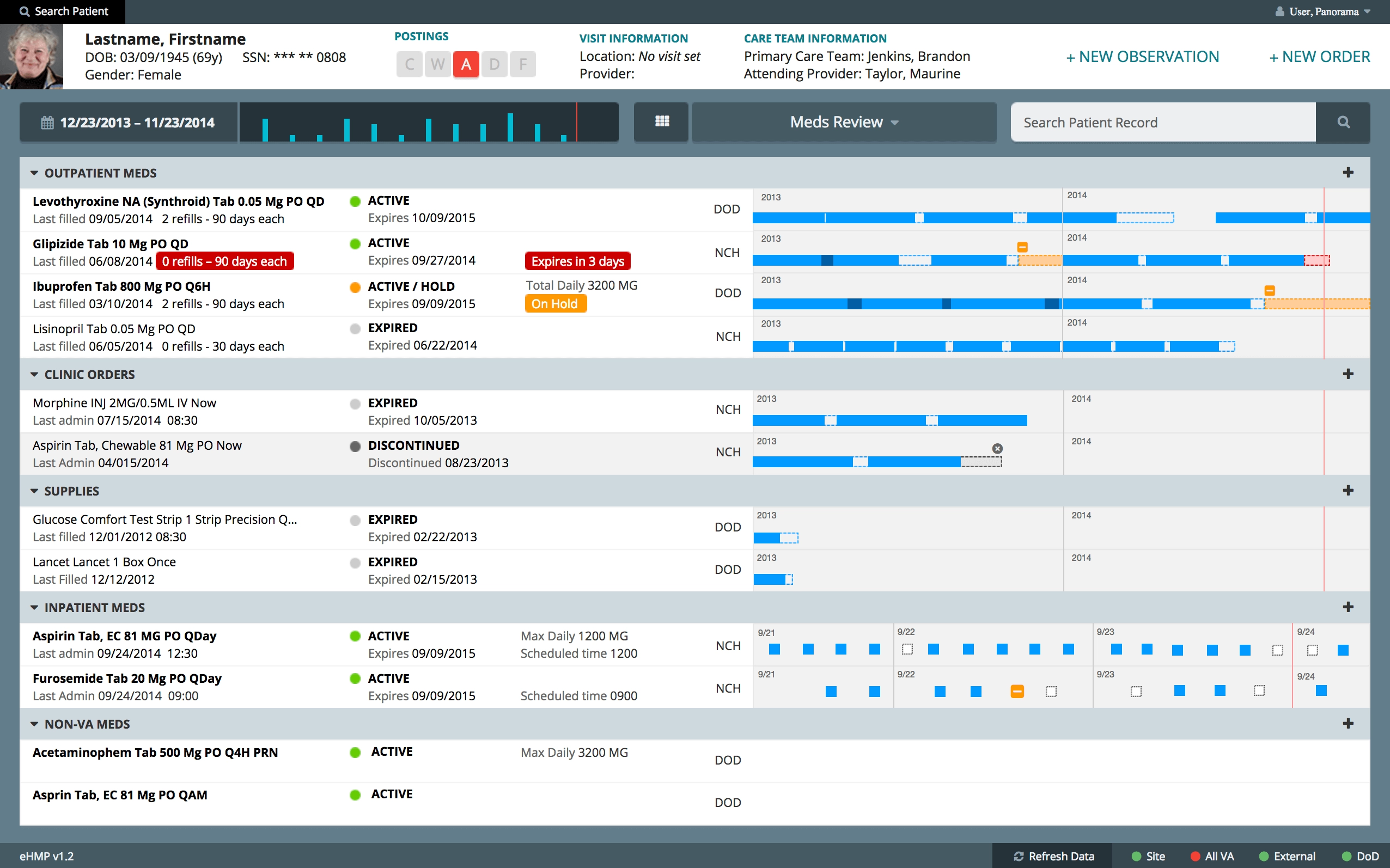
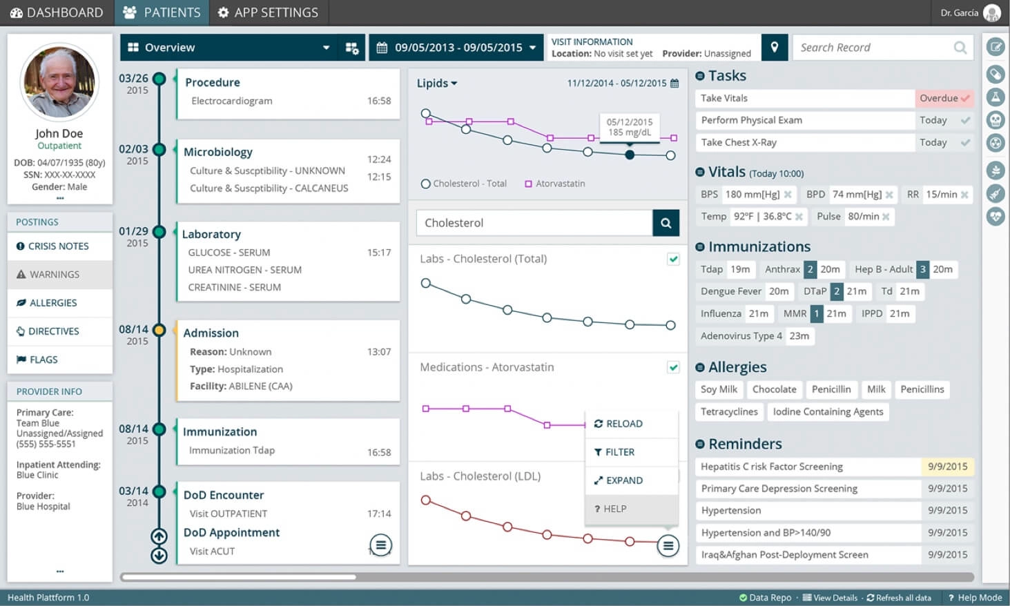
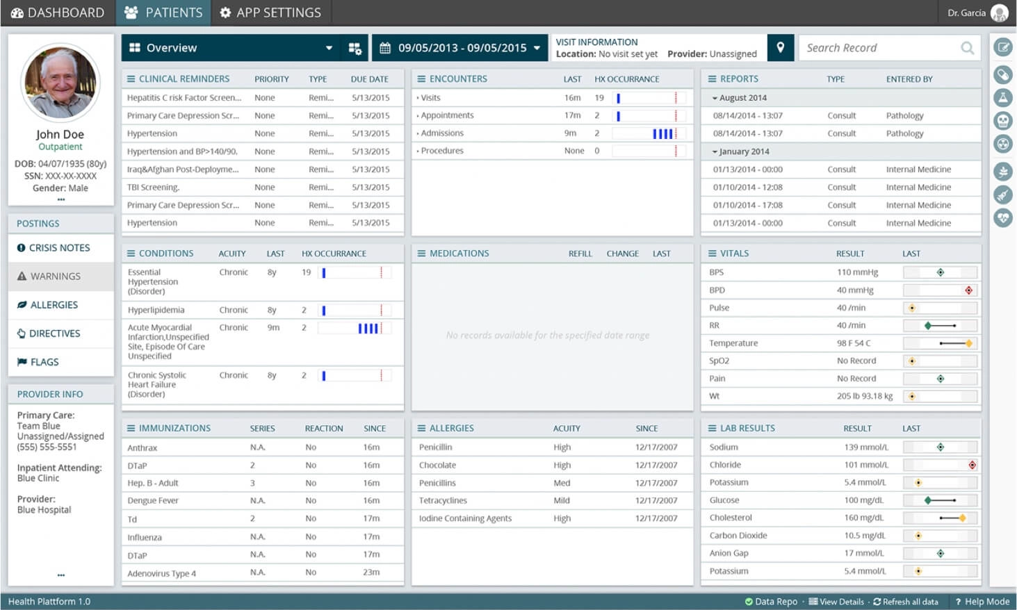
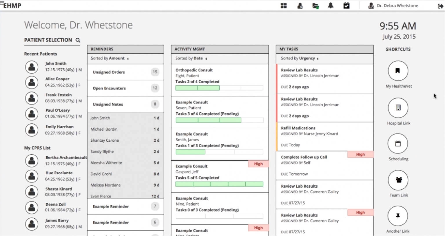
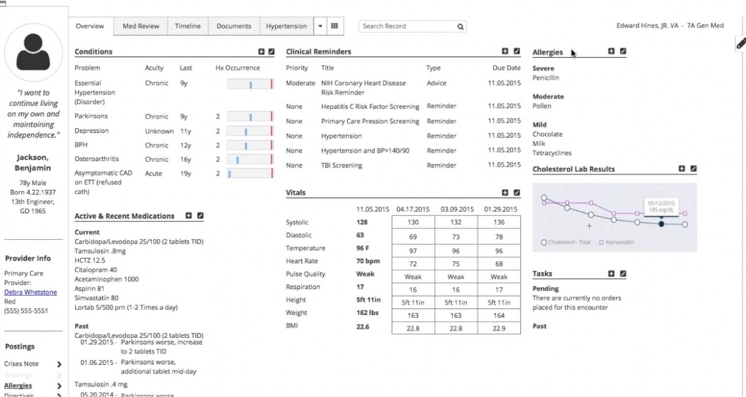
And this is eHMP 1.0, where I actually came in. The modernization had already started, the tiles were there, the data sources were wired. It was a real step forward from CPRS and it was still, for a pair of eyes on hour eleven, a bright wall.
The team

Twelve hours is the whole spec
The opportunity, as it was written down, was to make the application less heavy on the eyes, because practitioners work twelve hour shifts watching it. Filed like that, next to "expand the workspace" and "navigate faster", it looks like the soft item on the list. The one you trade away in month eight when the schedule gets honest.
But think about what is actually happening on that screen. A practitioner on hour eleven is not glancing at a chart, they are pulling lab values, dosages and allergies off a dense display, and they are doing it with eyes that have been fighting the same contrast since morning. Every bit of glare, every saturated block of color that earned its place in a slide deck, every widget that renders the critical number in the same weight as the trivial one, is a tax charged at exactly the moment nobody has anything left to pay it with. A misread decimal on a dosage is not a design critique. It is a person.
So I stopped calling it a visual concern and started calling it what it was, and once "less heavy on the eyes" is a patient safety argument, nobody trades it away in month eight. That is the whole trick, and it cost nothing but the willingness to say it out loud.
Around that sat the rest of the constraints, which were not negotiable either:
- Redesign the UI completely, and adapt the UX to it.
- Comply with HIPAA patient safety security rules, which govern how fast and how safely you may move between patient charts.
- Be 508 compliant, because all government software is, and it stacks a new layer of complexity on top of rules that were already strict.
- Respect medical emergency information and density. You do not get to solve a busy screen by removing what a doctor needs.
- Do all of it in less than a year.
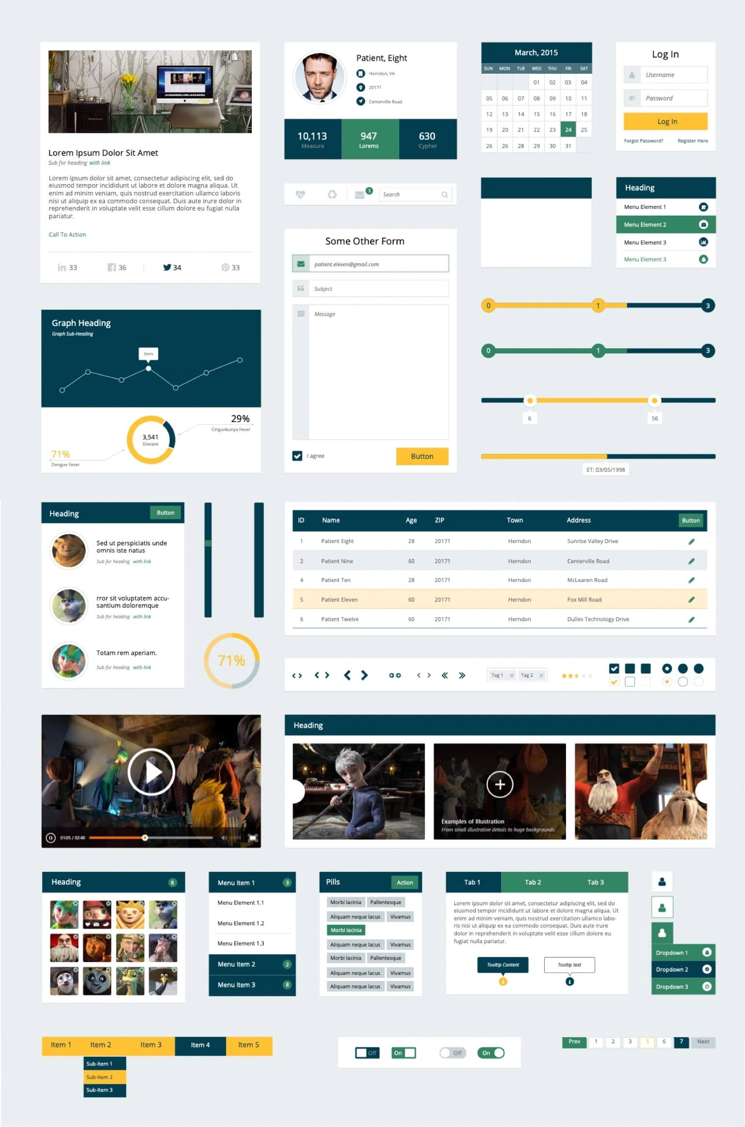
The kit I bought off the internet
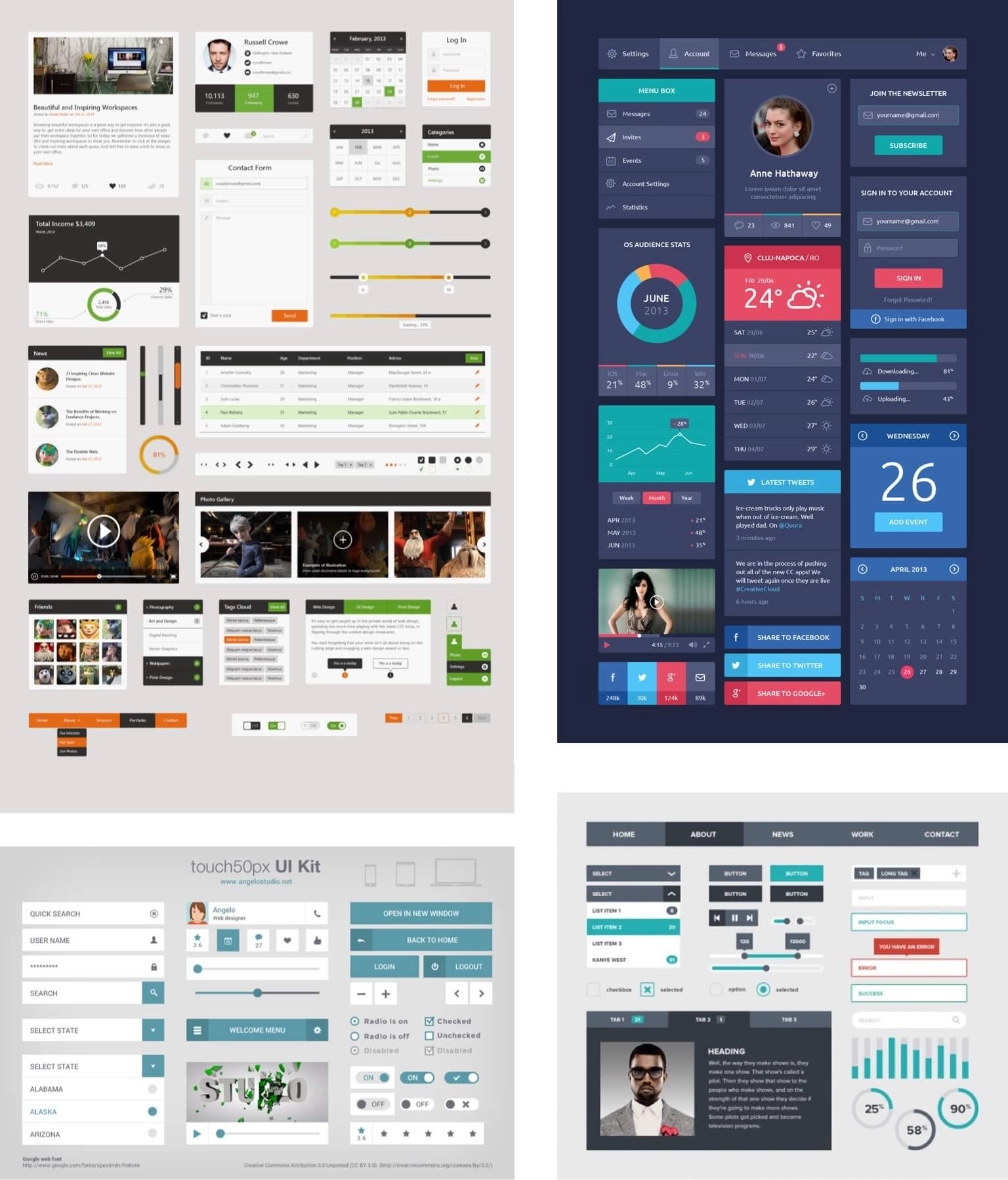
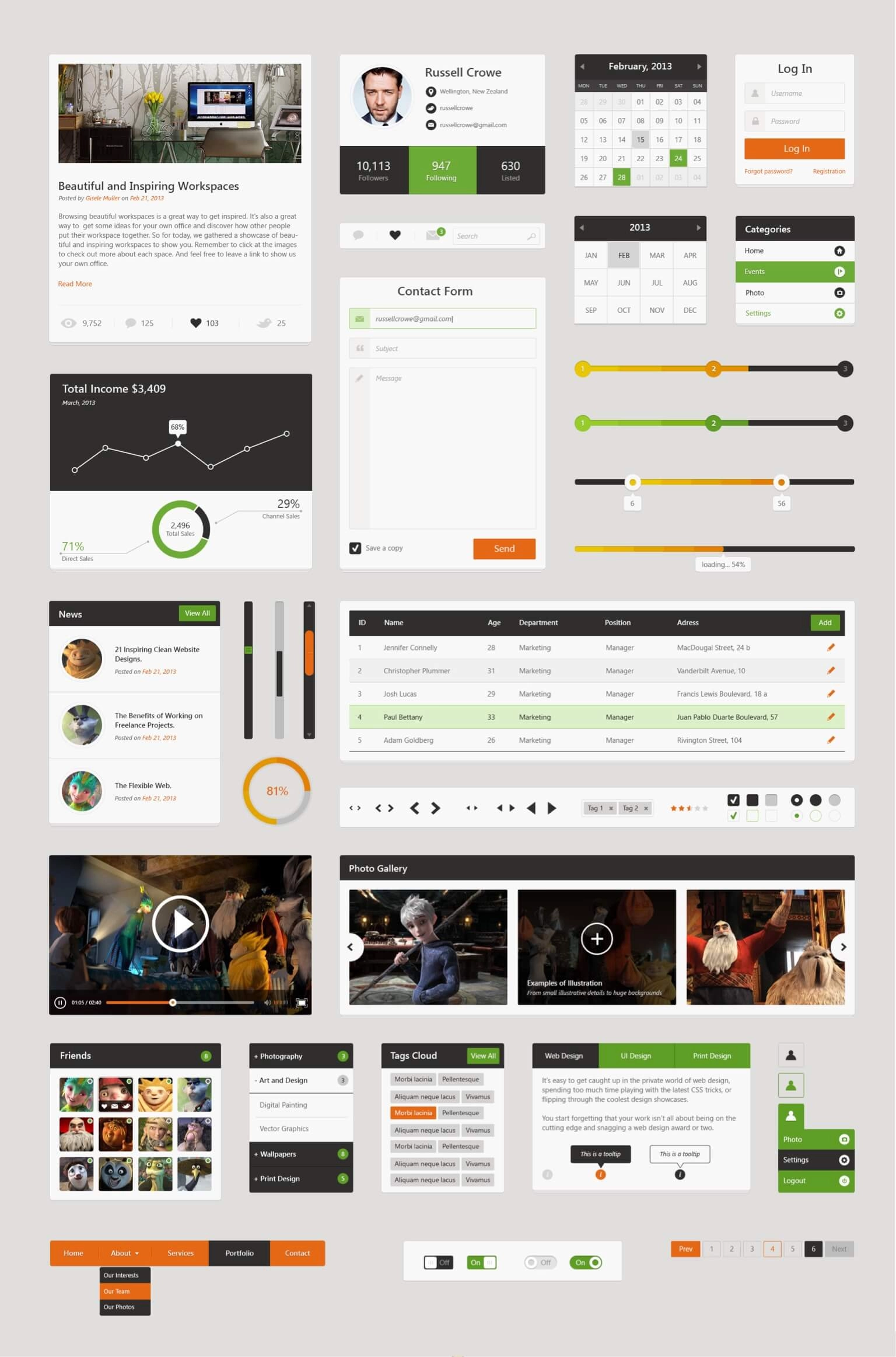
Less than a year to redesign an entire EHR. Would I have loved to build a visual language from the color theory up, a proper artifact with my fingerprints on every token? Oh boy, of course I would. It also would have been ego rather than strategy, and the calendar would have eaten it alive somewhere around month four.
So I went shopping instead. Surveyed the UI kits available on the internet, picked the one whose features genuinely translated to medical software rather than the one that photographed best, then streamlined it down to exactly what we needed and threw the rest away. The months that bought us went straight into the problems no kit was ever going to solve for us: density, hierarchy, and the fatigue.
That is the least glamorous decision on this page and the one I would defend hardest. Buying the foundation is what let us afford the parts nobody sells.
Rolling it across every screen
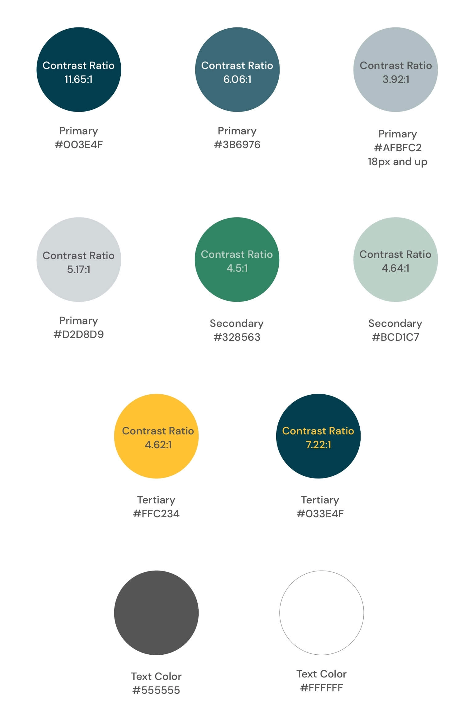
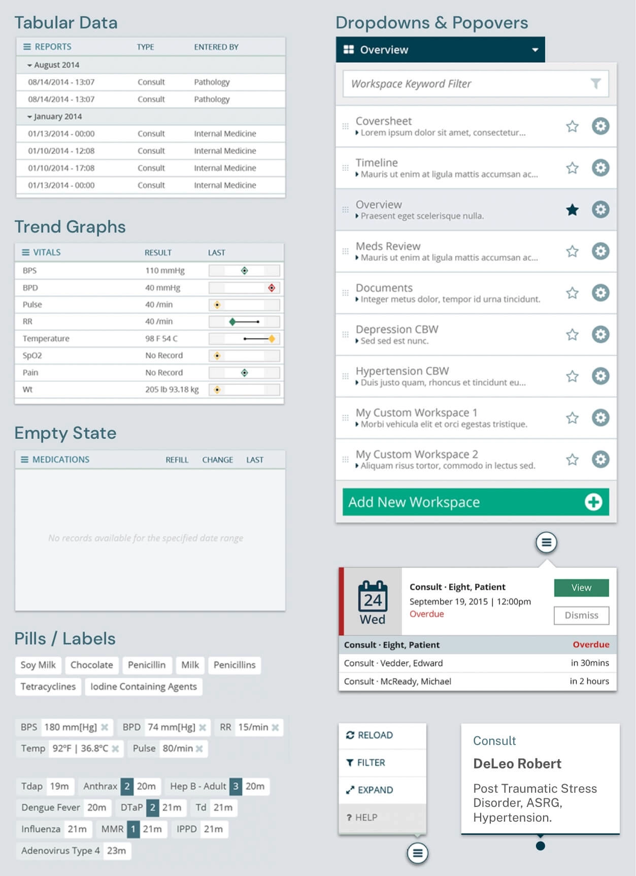
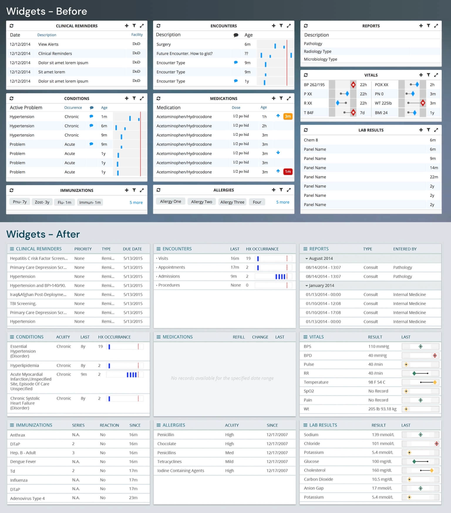
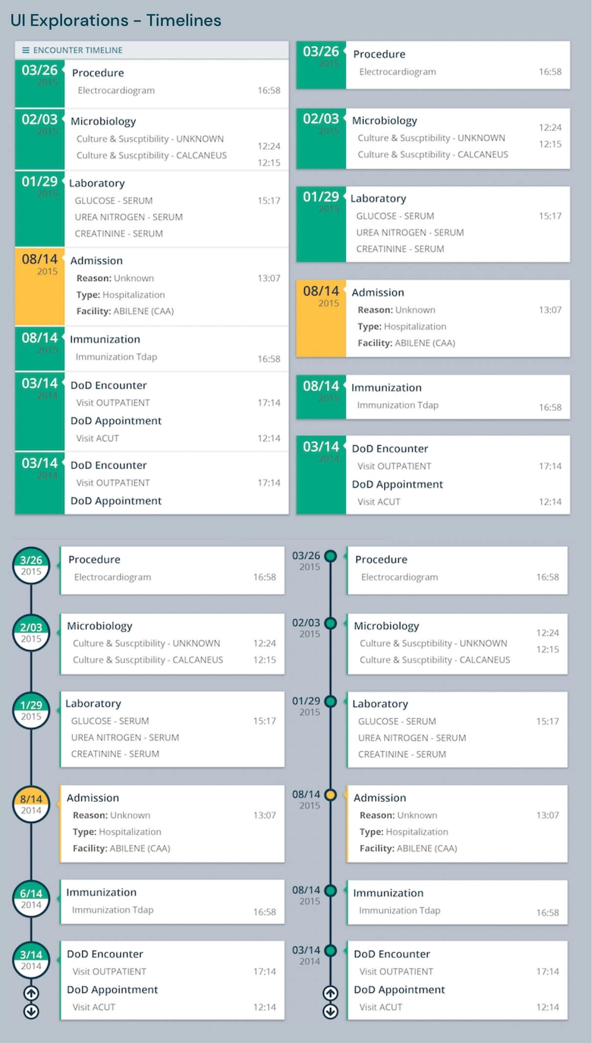
This was the heaviest lift for the entire team, because a visual language is a lovely idea until you have to land it on every single screen of an Electronic Health Record. We took an inventory of the screens, applied the global styles, took a second inventory of the widgets, then went through them one by one, modifying the look and feel, applying new interaction patterns where the old ones were fighting the user, and building new widgets where nothing that existed would do the job.
And here is the part I care about most. Those changes were not a folder of comps thrown over a wall for somebody else to interpret. We executed the HTML, the CSS and the JavaScript. The design and the shipped screen were the same artifact, which is the only arrangement I have ever fully trusted, and it is the reason a year was enough.
1st Proposal
Still too heavy on the eyes
The feedback was warm, and it also told us we had not gone far enough. The color scheme was more pleasant, said the practitioners, and there was still room to make it less heavy on the eyes. Which stung a little, and was completely fair. When the people living inside your screen for twelve hours tell you it is still bright, you do not get to argue with them, you go back and take more out.
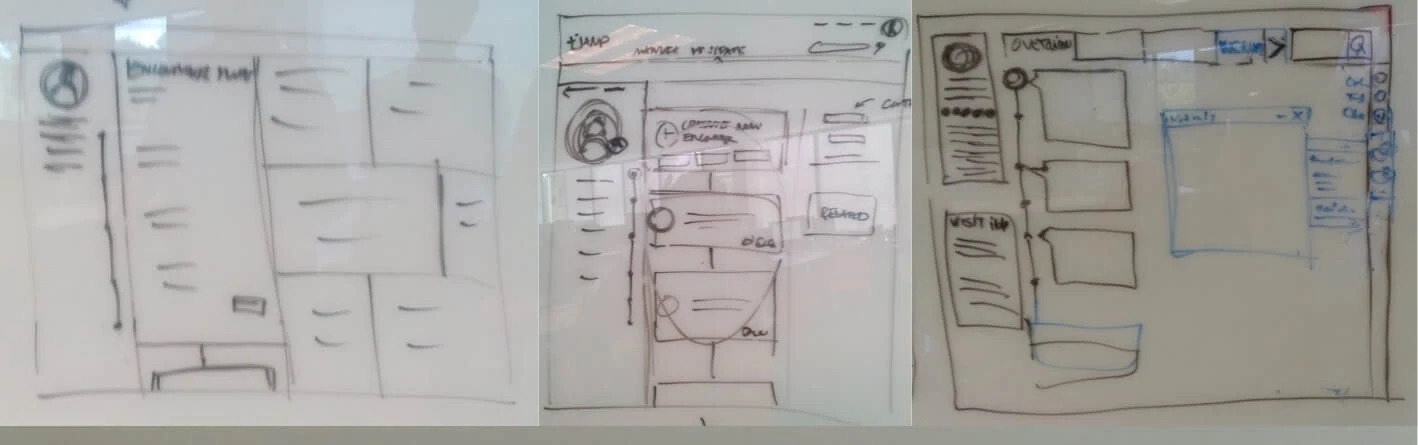
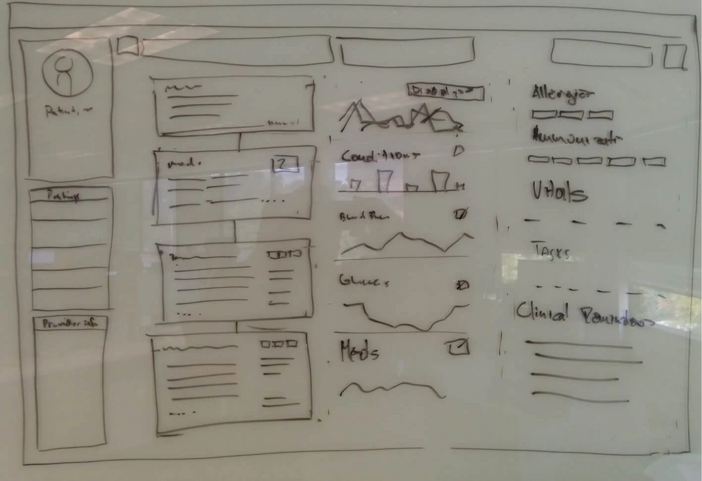
They wanted more from the workspace too: quick patient access, system tasks, patient journey progress indicators, clinical tasks, shortcuts into the rest of the platform. And they wanted a firmer visual hierarchy on the patient information that actually matters, which is the same fatigue conversation wearing a different hat.
What the practitioners asked for next
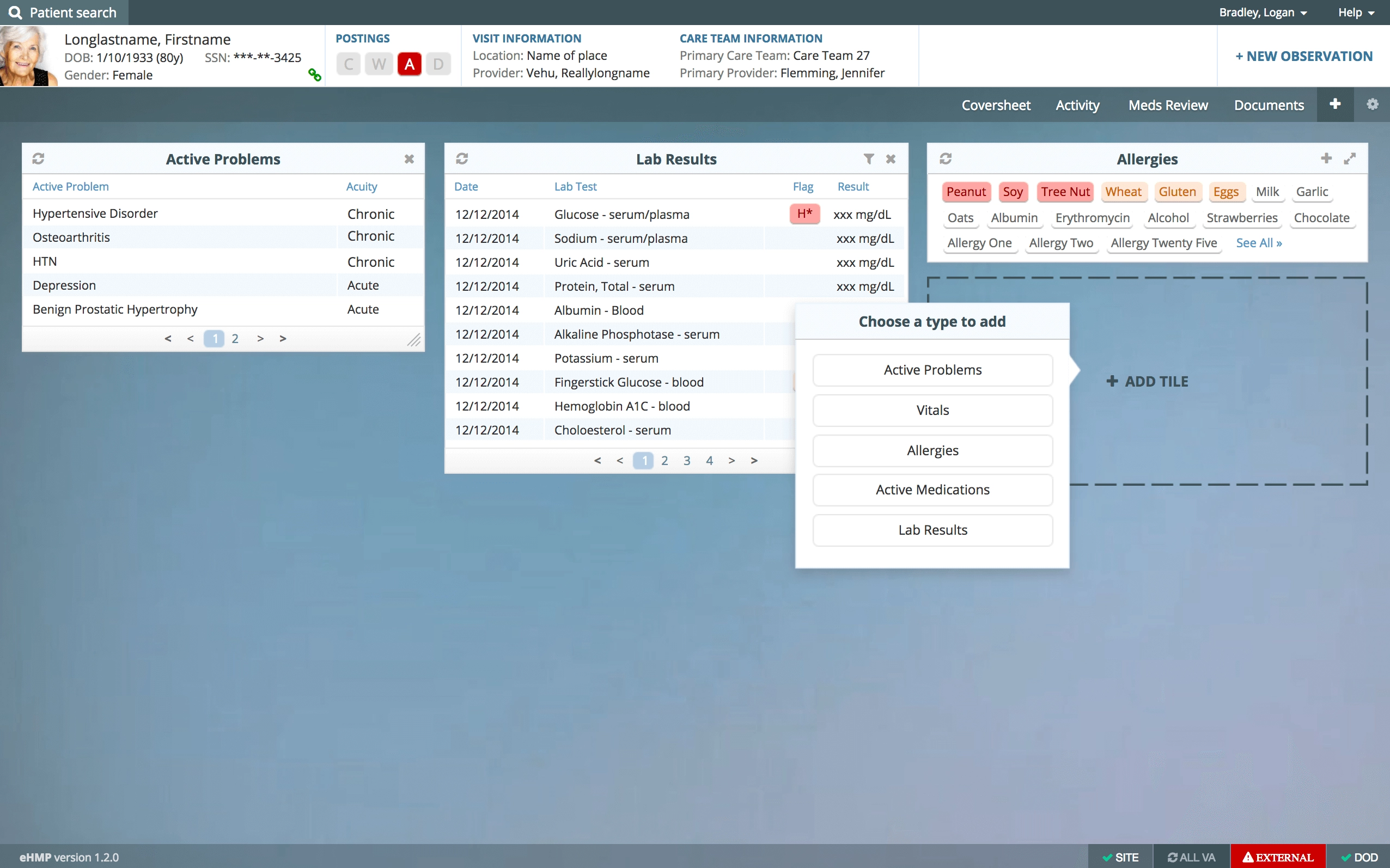
So we went back in, and the second stage of the project was really that feedback turned into a backlog. Every item on it came down to the same fight between speed and safety:
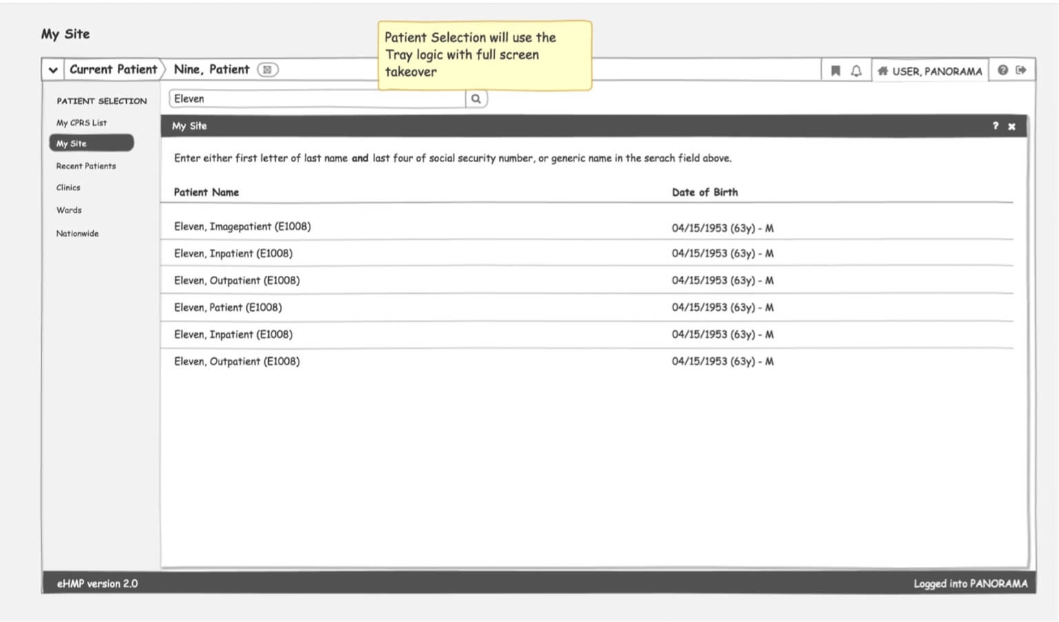
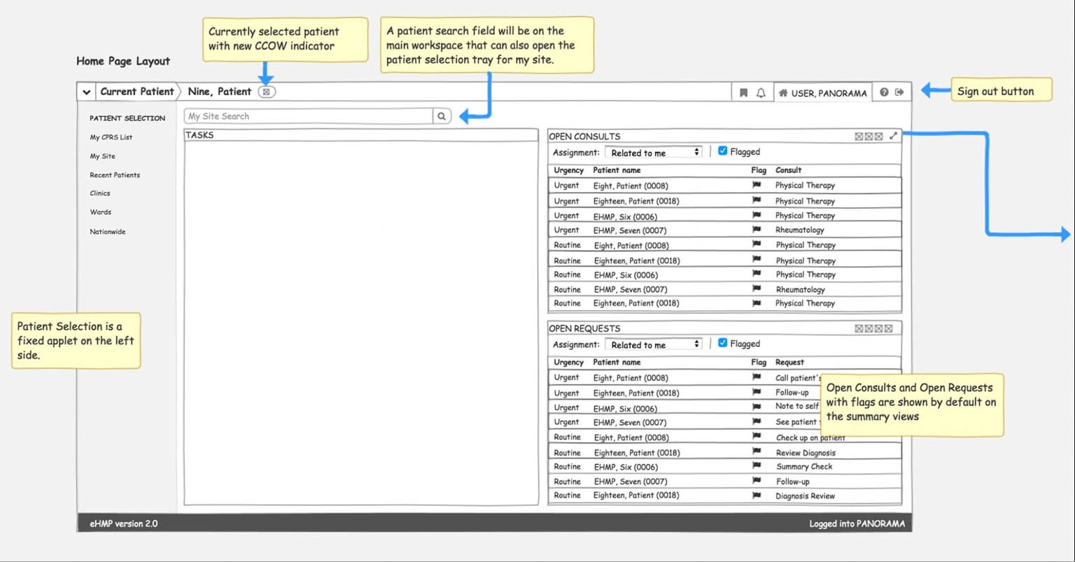
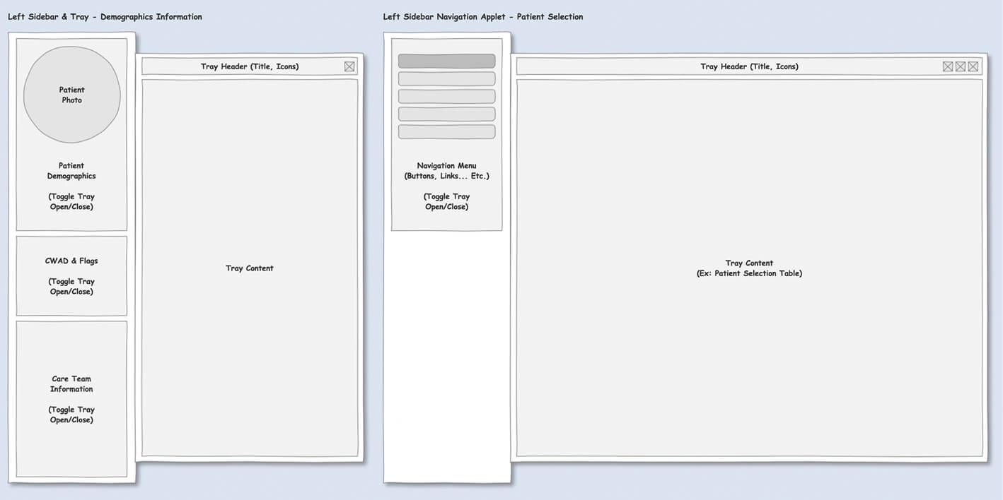
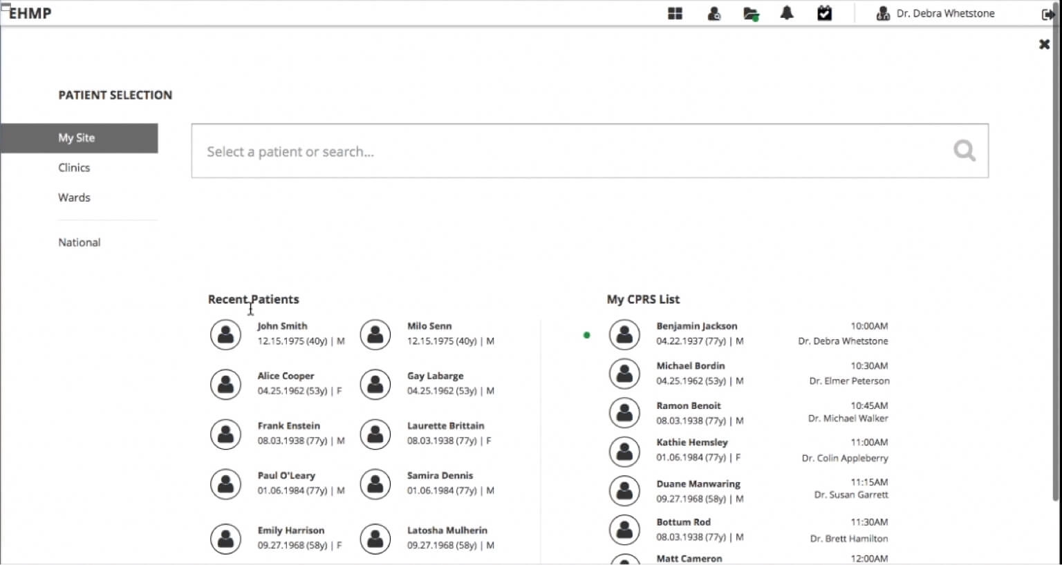
- Make patient search and selection instant, while still honoring the safety rules that exist precisely so nobody opens the wrong veteran's chart in a hurry.
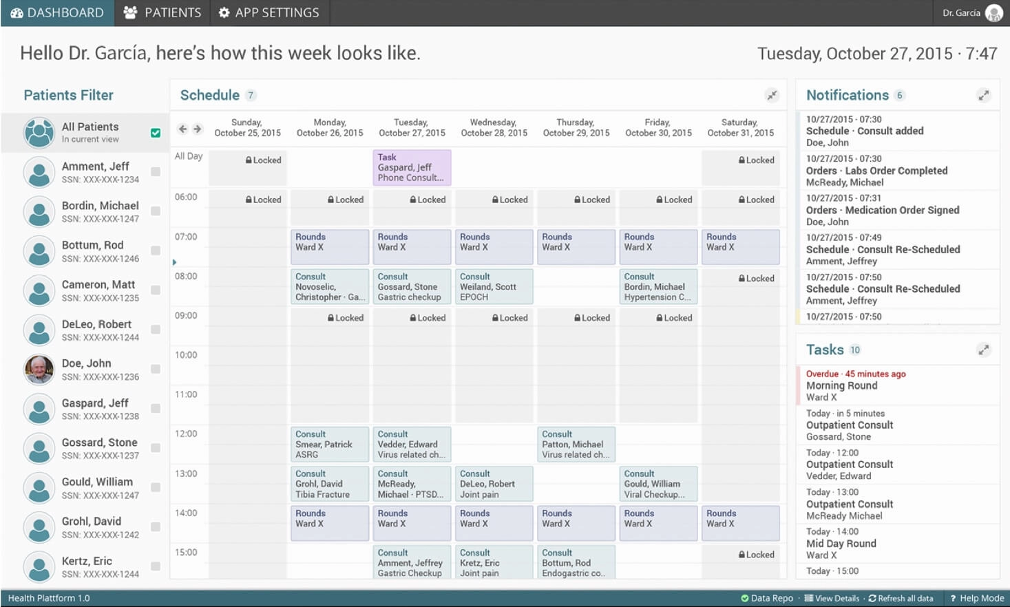
- Add a Provider Workspace with a daily outlook of the practitioner's tasks.
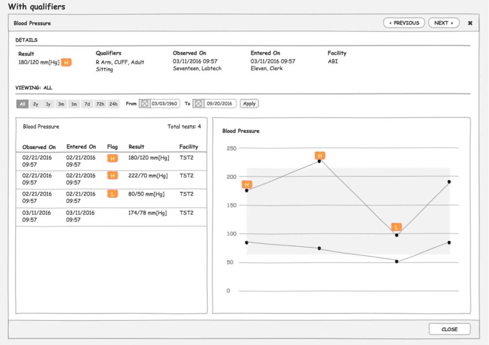
- Let practitioners customize the patient chart, because a cardiology patient and a mental health patient do not need the same screen.
- Put note taking and the ability to order tests, imagery and meds directly on the patient view, instead of somewhere else entirely.
Before drawing any of it we took an inventory of the screen flows for every user type, because "add a workspace" means one thing to a physician and something else entirely to a nurse or a clerk.
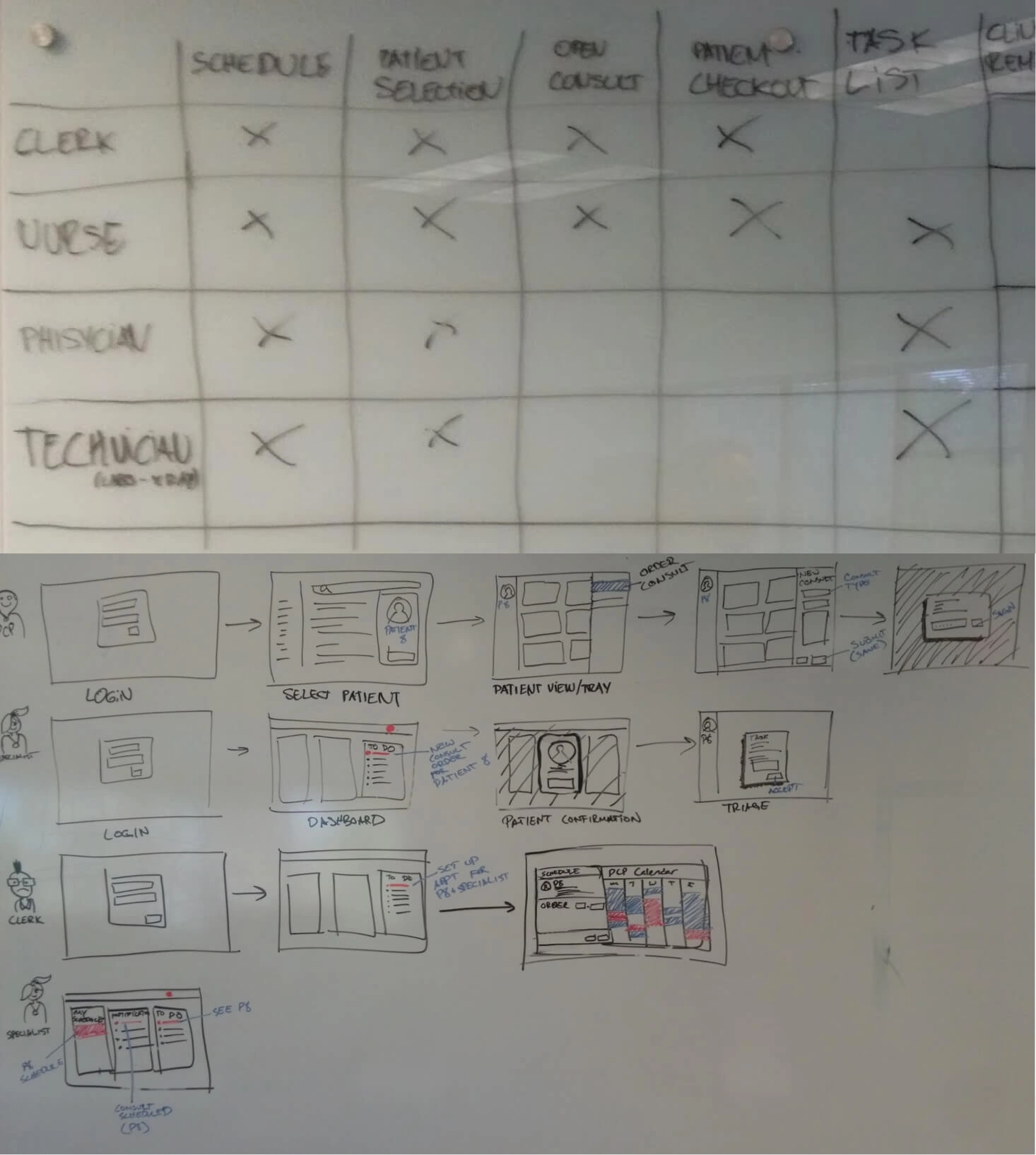
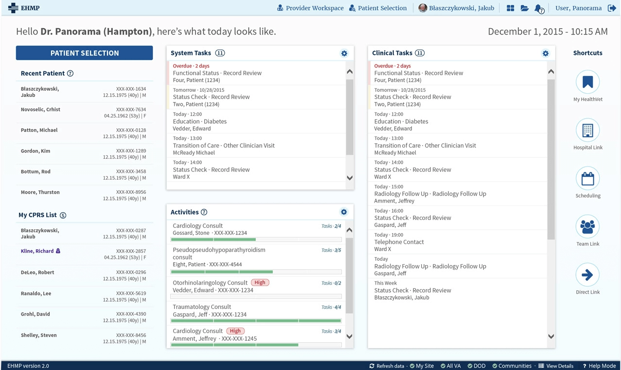
The Provider Workspace
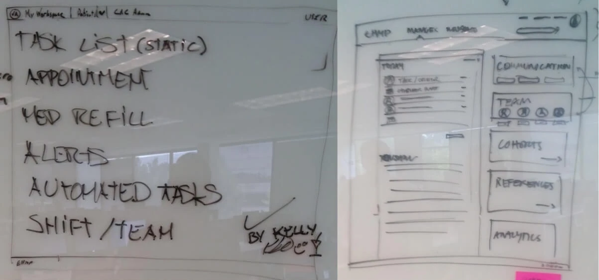
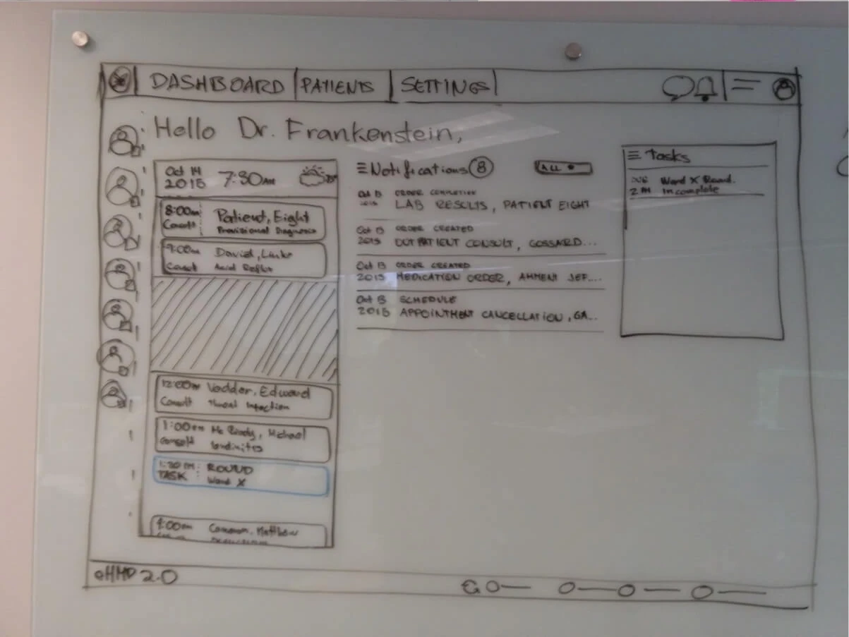
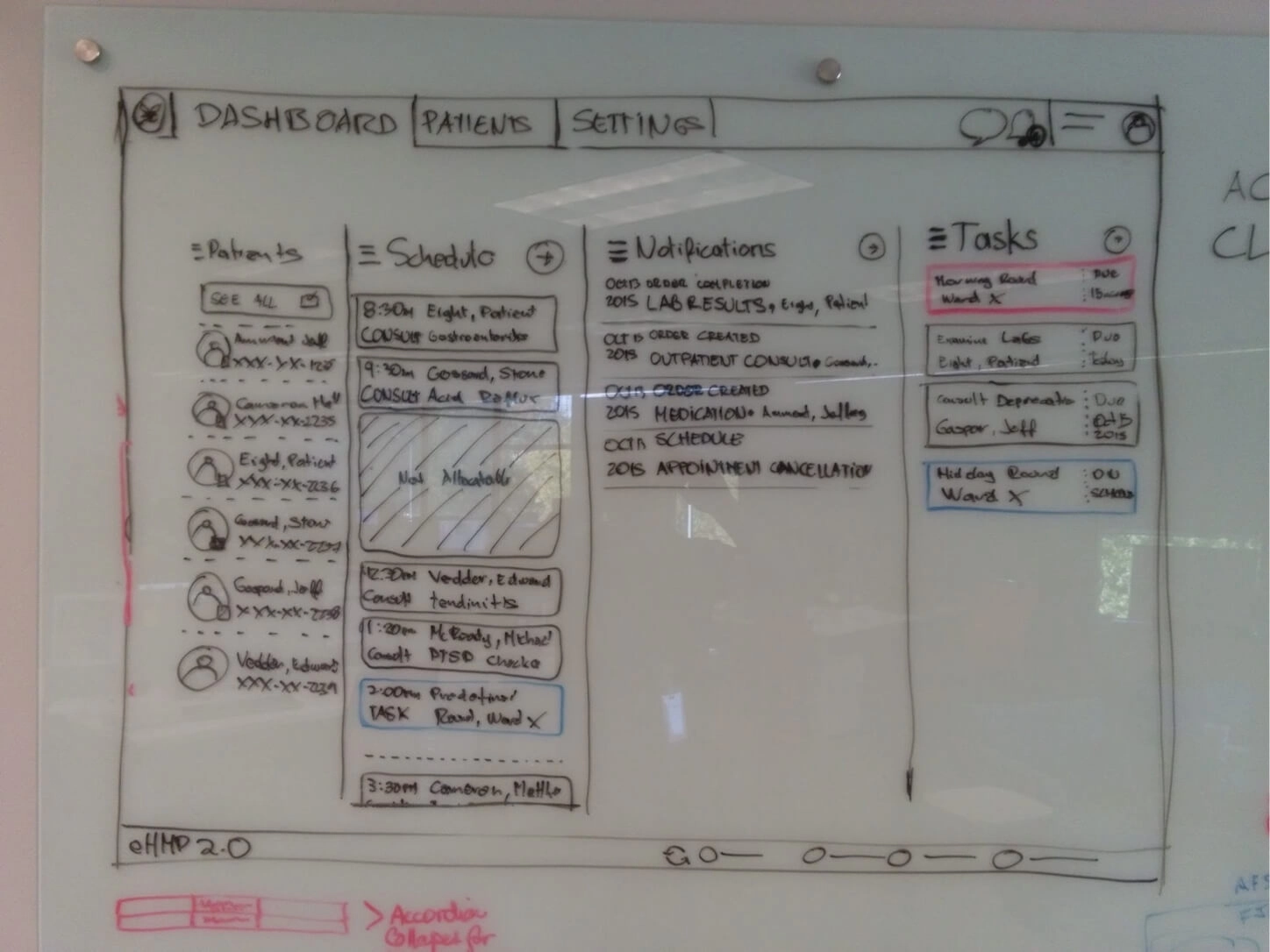
A practitioner walking into a shift wants one question answered before any other: what does today look like? The old software answered that by not answering it, so the workspace became the place where the day lives. Tasks, the patient journey, the clinical work waiting, and the shortcuts that spare somebody from hunting across a platform for the thing they do forty times a day.

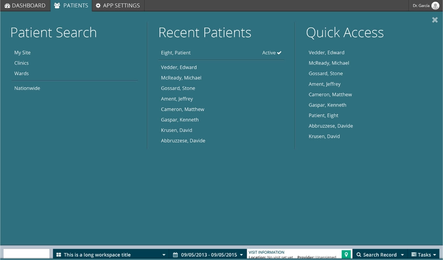
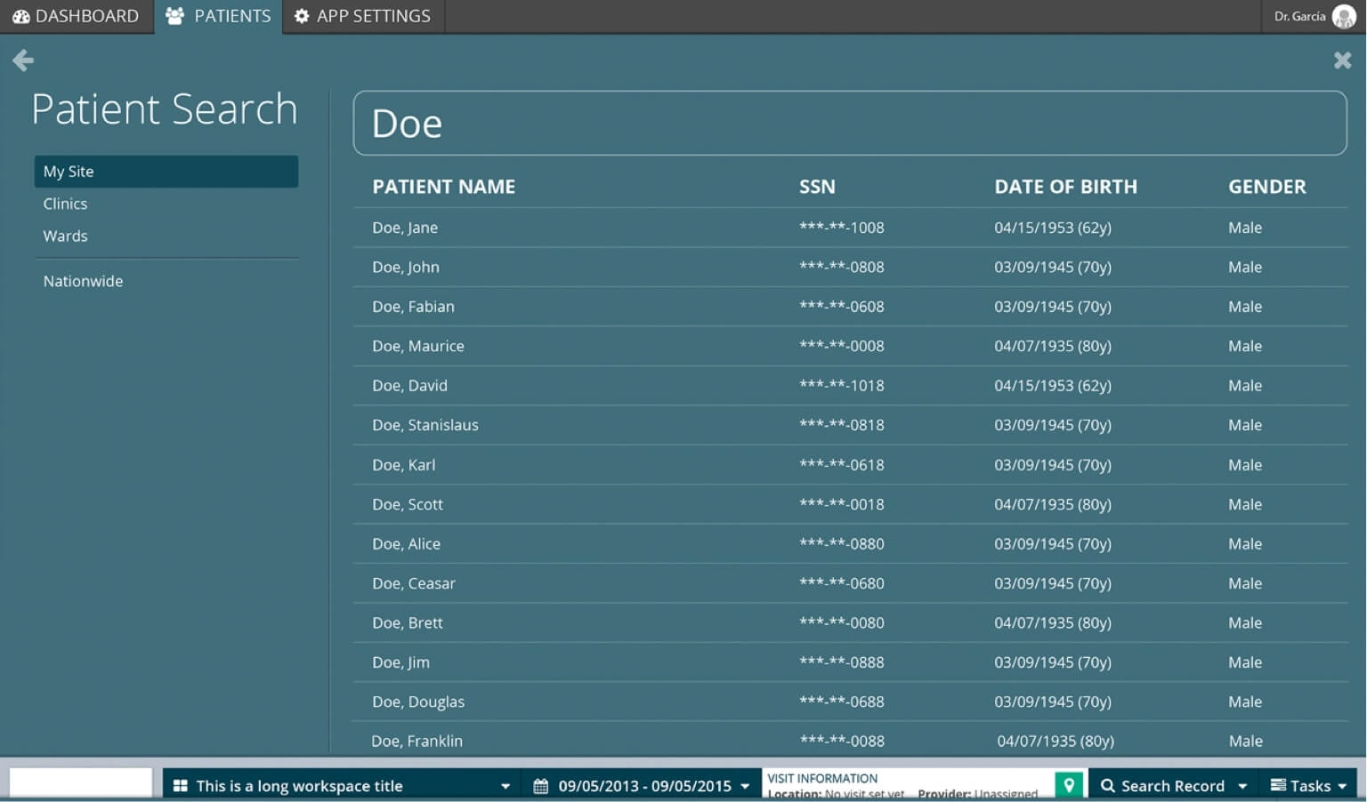
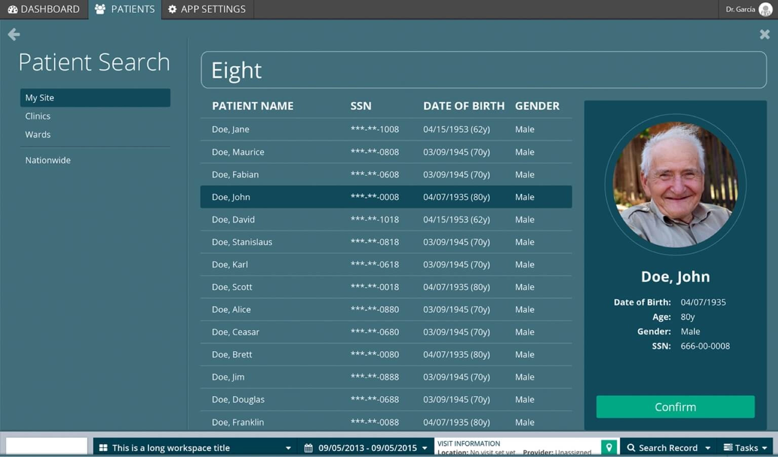
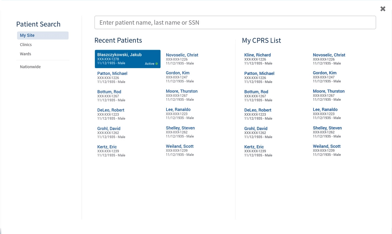
Search fast, open the right veteran
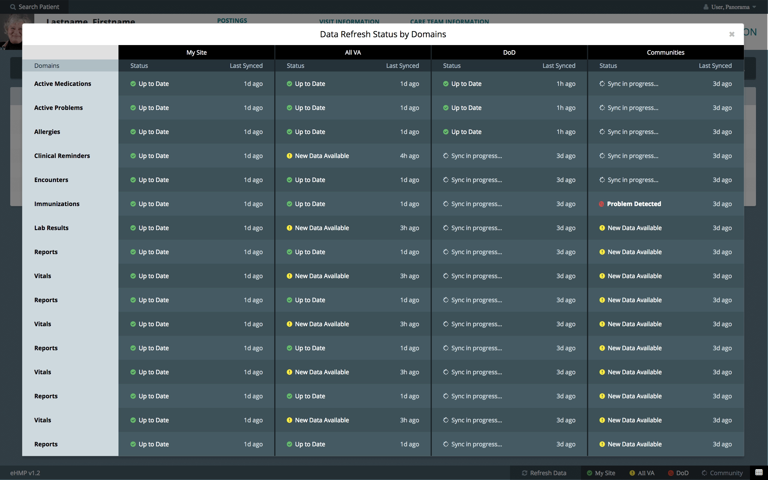
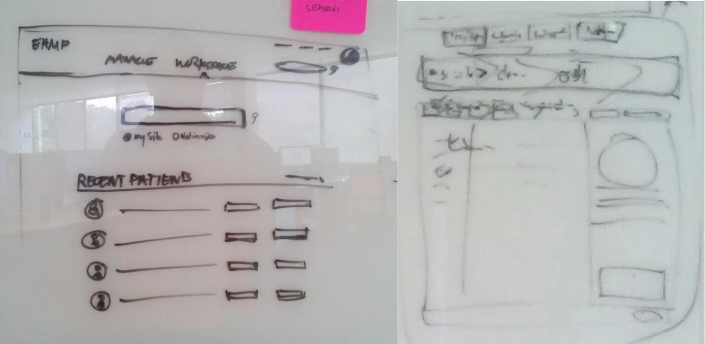
This is the one worth pausing on. Everyone wants search to be instant, and HIPAA quite reasonably wants you to be certain about who you just opened, and those two demands do not like each other one bit. The resolution was not to pick a side. We let the search fly, and moved the certainty into a confirmation step, so the fast path stays fast and the dangerous moment gets a beat of its own. The last slide here is that beat.
A chart that bends to the patient
A cardiology patient and a mental health patient do not need the same screen, so the chart had to bend. And once a practitioner is finally standing in front of the right chart, the last thing you want is to send them somewhere else to act on what they just read, which is why note taking and the ordering of tests, imagery and meds all landed directly on the patient view.
The final stretch
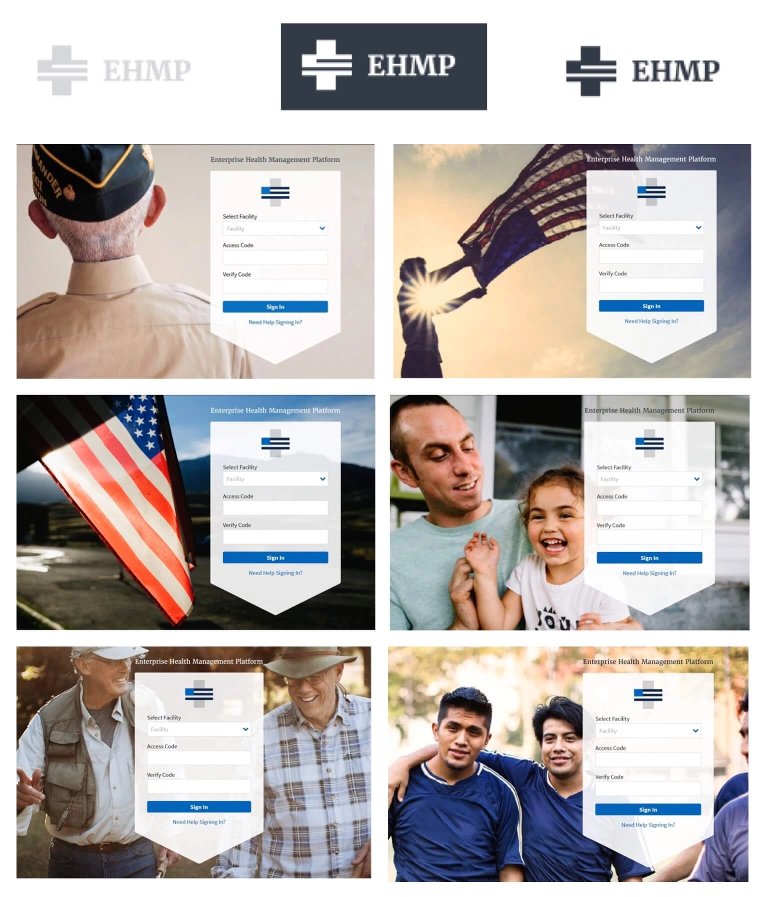
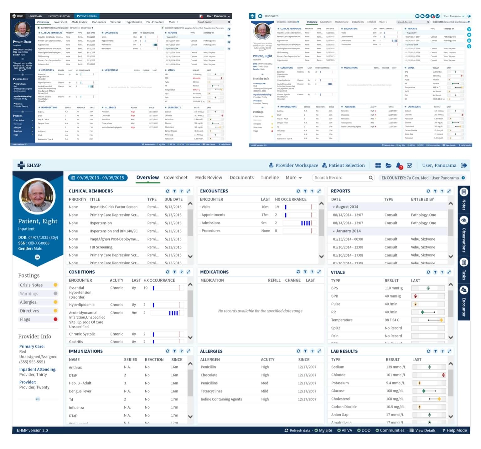
Fjord came in on branding for this stage, and we worked out how the UI elements could adapt to the new guidelines without undoing a year of restraint. The last thing to land was the consult tray.
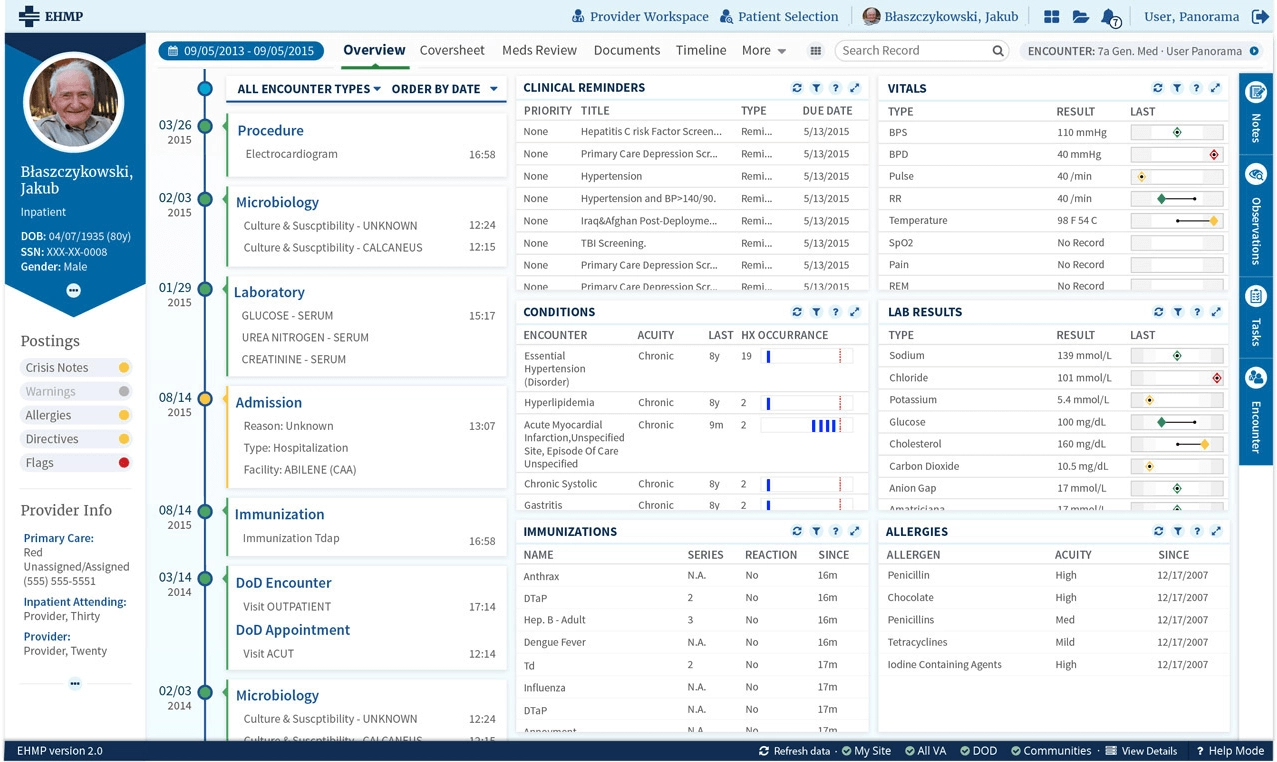
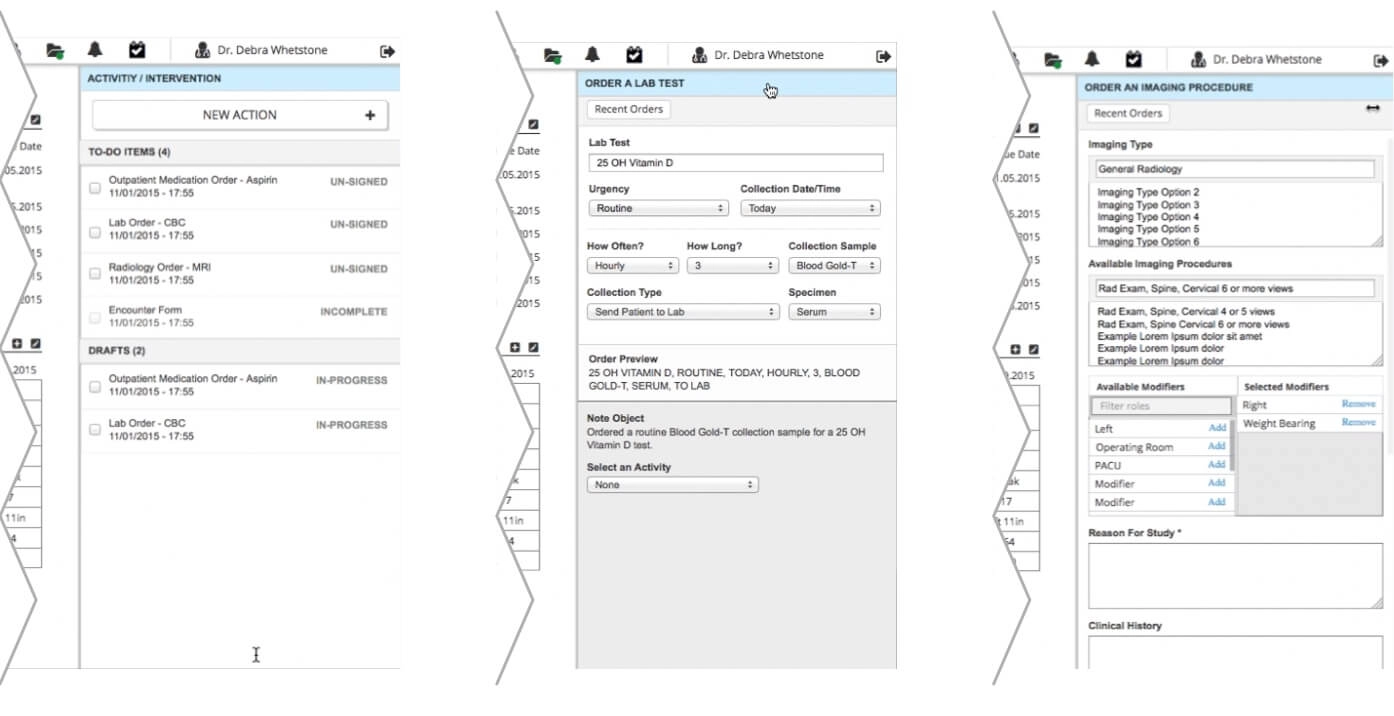
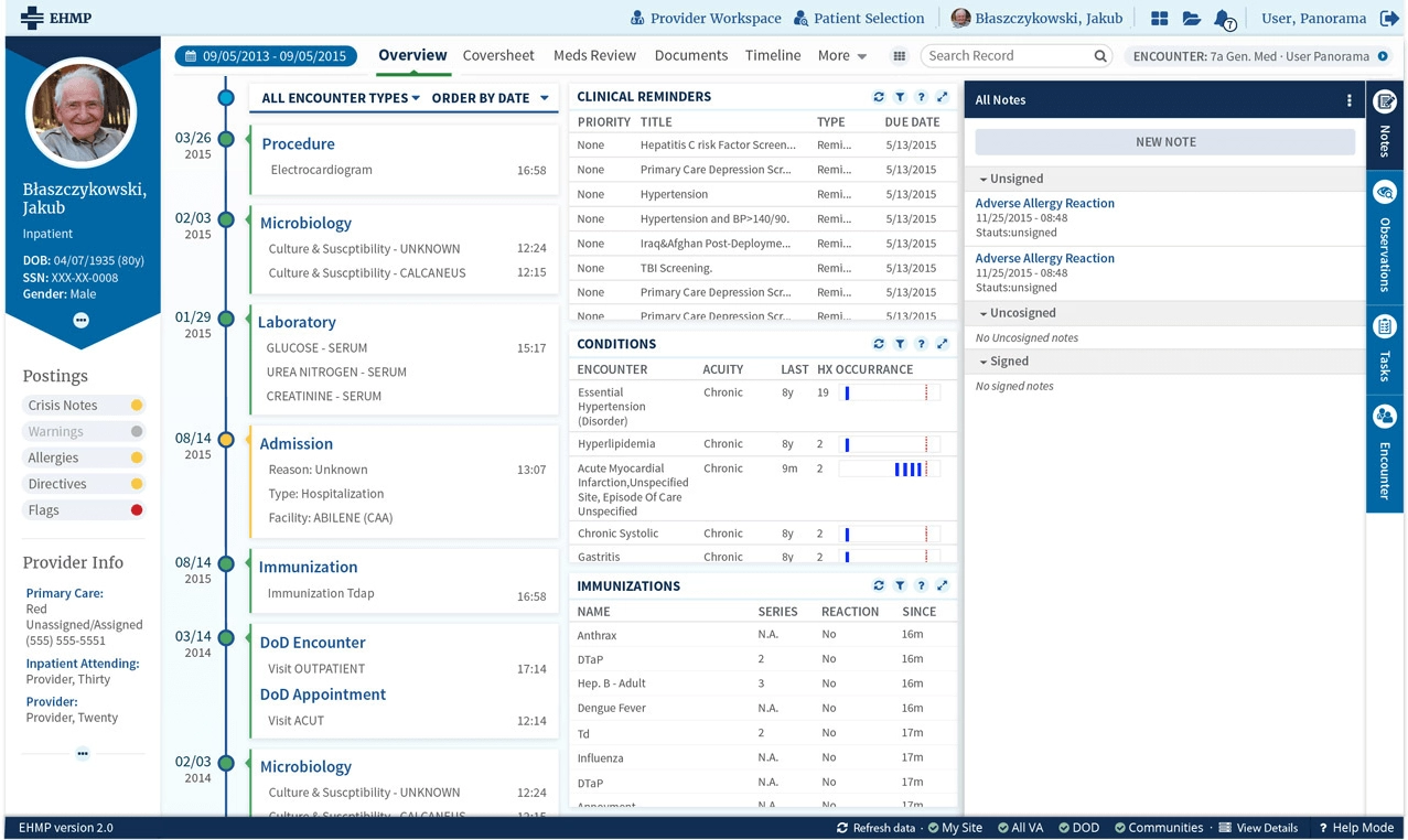
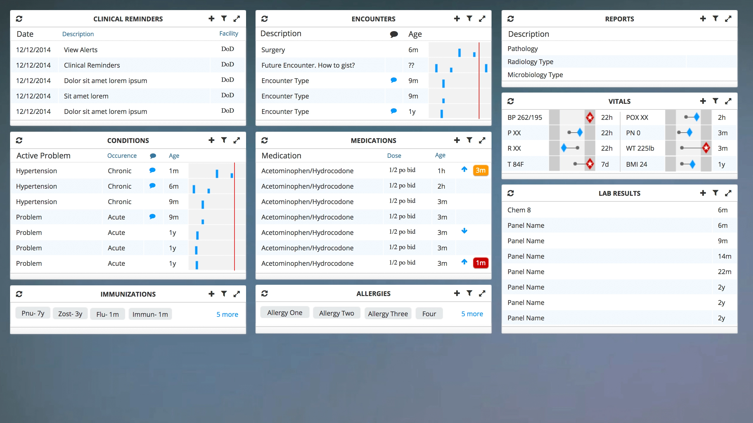
Final Proposal
A happy ending
The customer and the users were genuinely happy with what we handed them, and the work went on to earn the accreditation for the project re-compete, which for Accenture represented a contract for almost 300 million dollars. Execs, as you can imagine, were really happy about it.
What I took out of that year is not the contract though. It is the arithmetic underneath it. We had less than twelve months, and we chose to spend them on tired eyes instead of on a visual language that would have impressed exactly the people who were never going to use the thing. Designers love building the foundation themselves, I certainly do. But in my experience the ones who buy the foundation and spend what they saved on the actual problem are the ones who ship, and on a chart somebody reads at hour eleven, shipping is the entire point.
Video Walkthrough
An 8 minute video showcasing some aspects of the project.