Carus Publishing · The Reader Isn't the Buyer (2014)

Subscriptions were bleeding and everyone in the building was studying the readers, who are children. Children do not have credit cards. The person typing the card number was a grandparent buying a feeling, and the checkout treated them as an afterthought. We rebuilt the flow around them and renewals rose 25%.
Carus Publishing is a renowned provider of educational and cultural content for a K-12 audience, the family of magazines behind Cricket. The battleground for their declining renewals was the e-commerce checkout, which is usually where this kind of confusion goes to show itself.
TL;DR
- Renewals were sliding, and every conversation in the building was about the reader: what kids want, what kids read, how to reach kids.
- Kids do not pay. The buyer is a grandparent purchasing a gift subscription, and the checkout had been built as though they did not exist.
- Small type, more steps than a mortgage, and an account required before you are allowed to give somebody a present.
- The Baymard Institute had already solved the boring half of this, so I took it off the shelf rather than re-deriving it: fewer steps, guest checkout, bigger type.
- The other half was that nobody buys a magazine subscription. They buy "I am investing in this child," so the copy and the art had to say that back to them.
- Renewals rose 25%, and it gave Carus the momentum to start planning a move into digital publications.
Everyone was studying the kids
Cricket is a family of magazines for a K-12 audience, which is a polite way of saying the reader is a child. So when renewals started sliding, every conversation went where you would expect it to go. What do kids want. What are kids reading now. How do we reach kids.
Do children have credit cards? They do not.
The person actually typing a card number into that checkout was, more often than not, a grandparent buying a gift for a grandchild, and the checkout had been designed as though that person did not exist. Everybody had spent their research budget on the audience and nobody had spent an hour on the customer, and those turned out to be two entirely different people separated by about fifty years and a pair of reading glasses.
The checkout they had
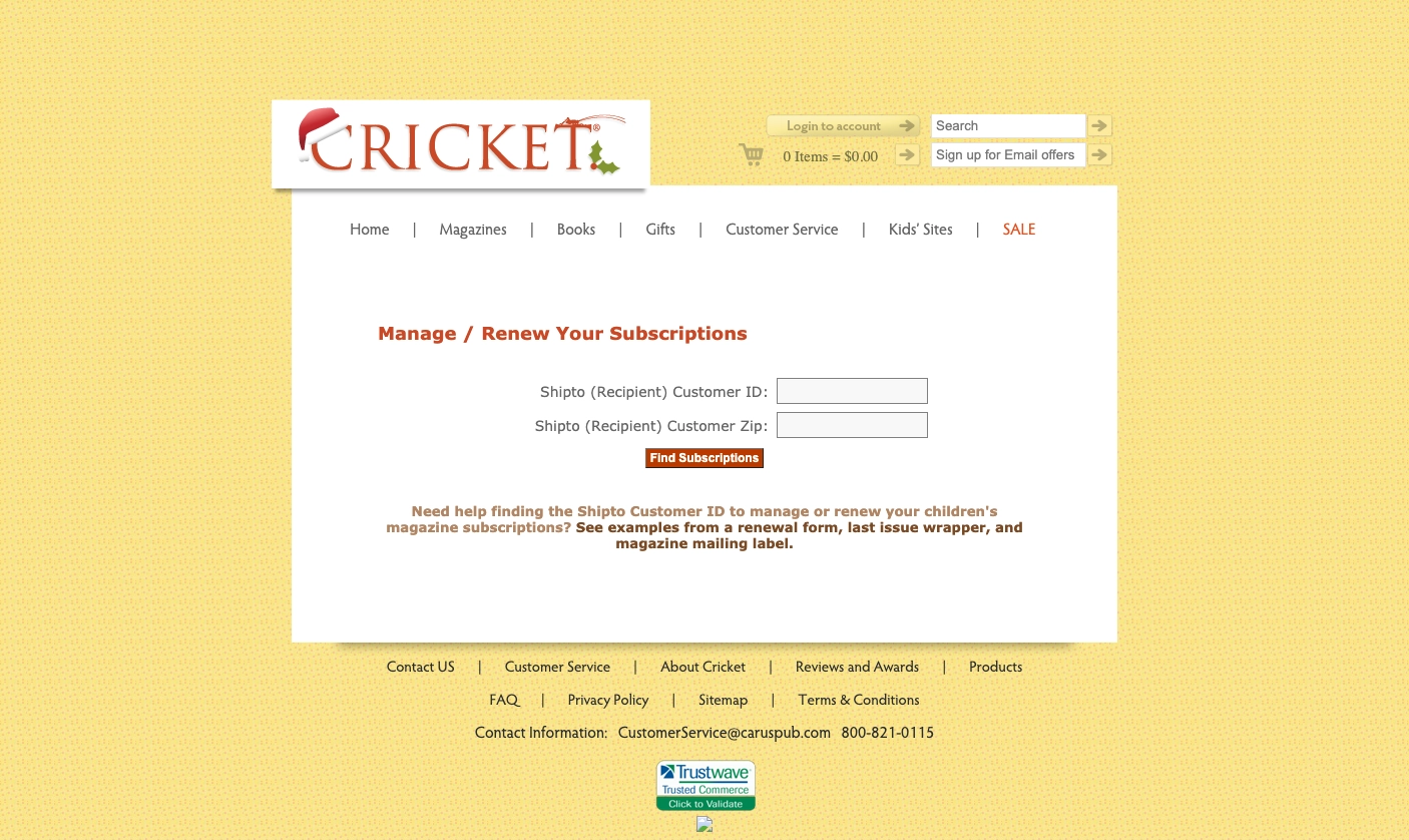
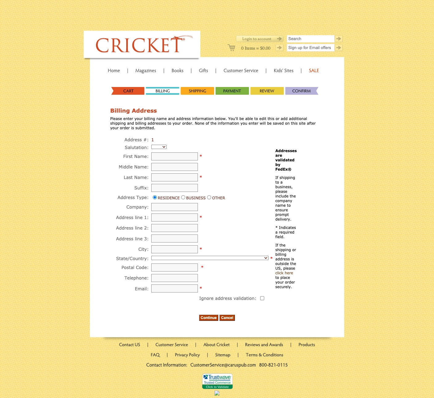
Small fonts. A process with more steps than a mortgage. And an account you had to create before the system would let you hand somebody a present. Have a look at what a sixty-eight year old was being asked to get through in order to give money to a children's magazine.


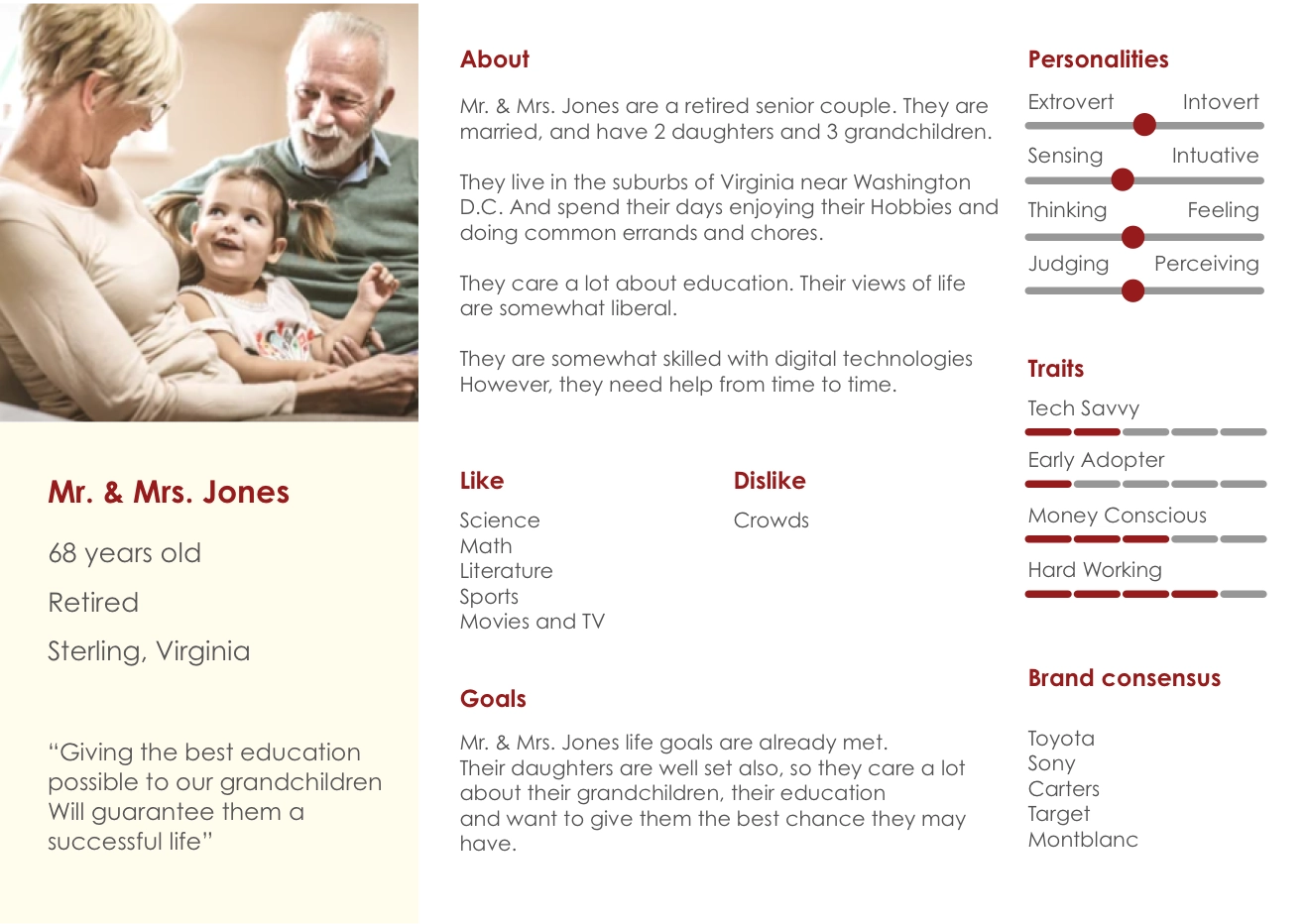
Mr. & Mrs. Jones
So we went and drew the person who actually pays. A retired couple, a deep appreciation for education, and moderately tech-savvy, which is the most important word in that sentence. Moderately. They are not helpless and they do not need to be coddled, they will happily buy online, but they will not fight you for the privilege. Give them a form with six point labels and a mandatory account and they will simply close the tab and mail a check next year, or not.
Mr. & Mrs. Jones sat in the room for every decision after that.
Baymard already did the boring half
Half of this problem had been solved before I ever showed up, and pretending otherwise would have been vanity dressed as research. The Baymard Institute has been running e-commerce usability studies for years, and their findings were sitting there free for the reading, so we took them off the shelf:
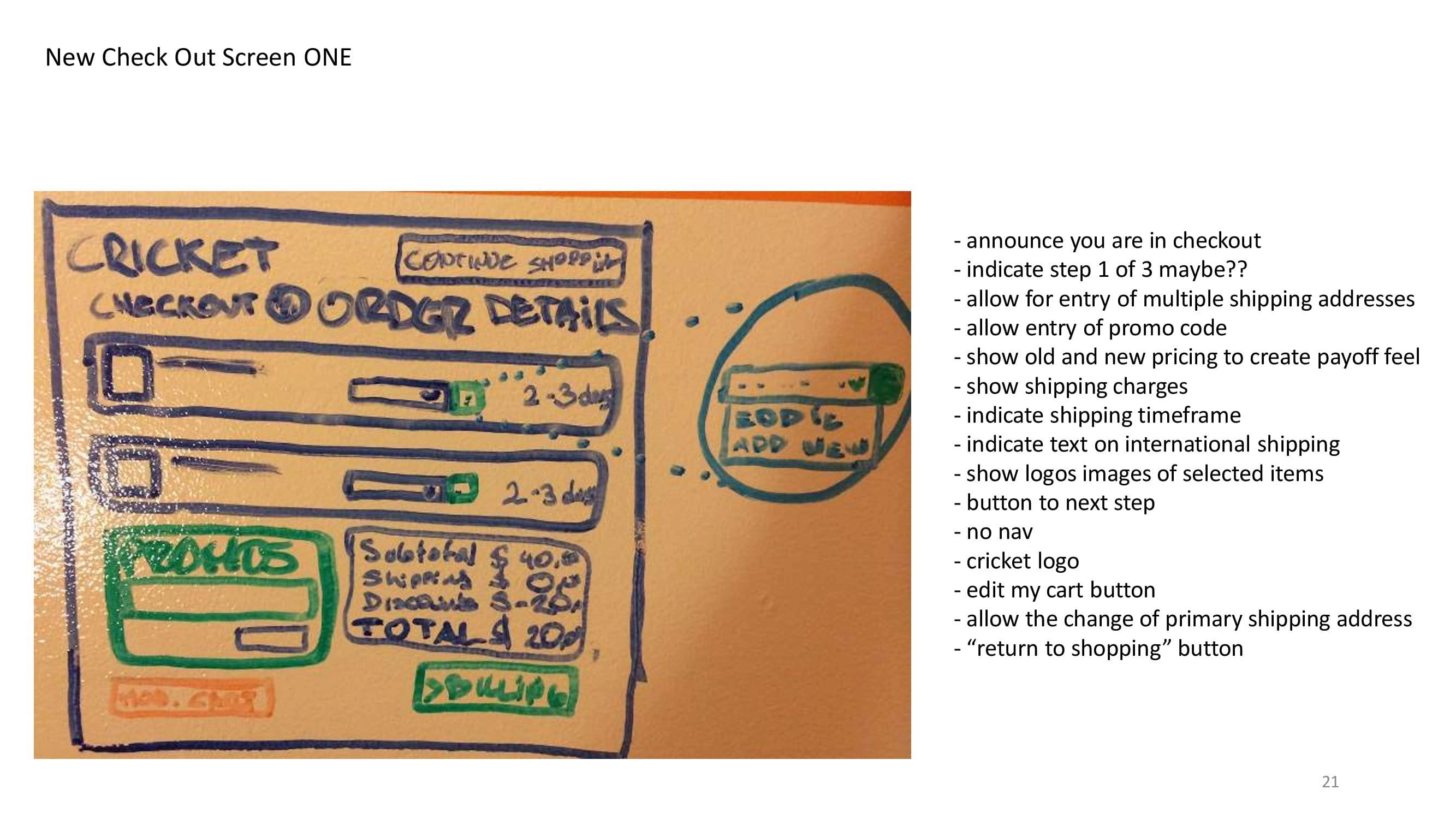
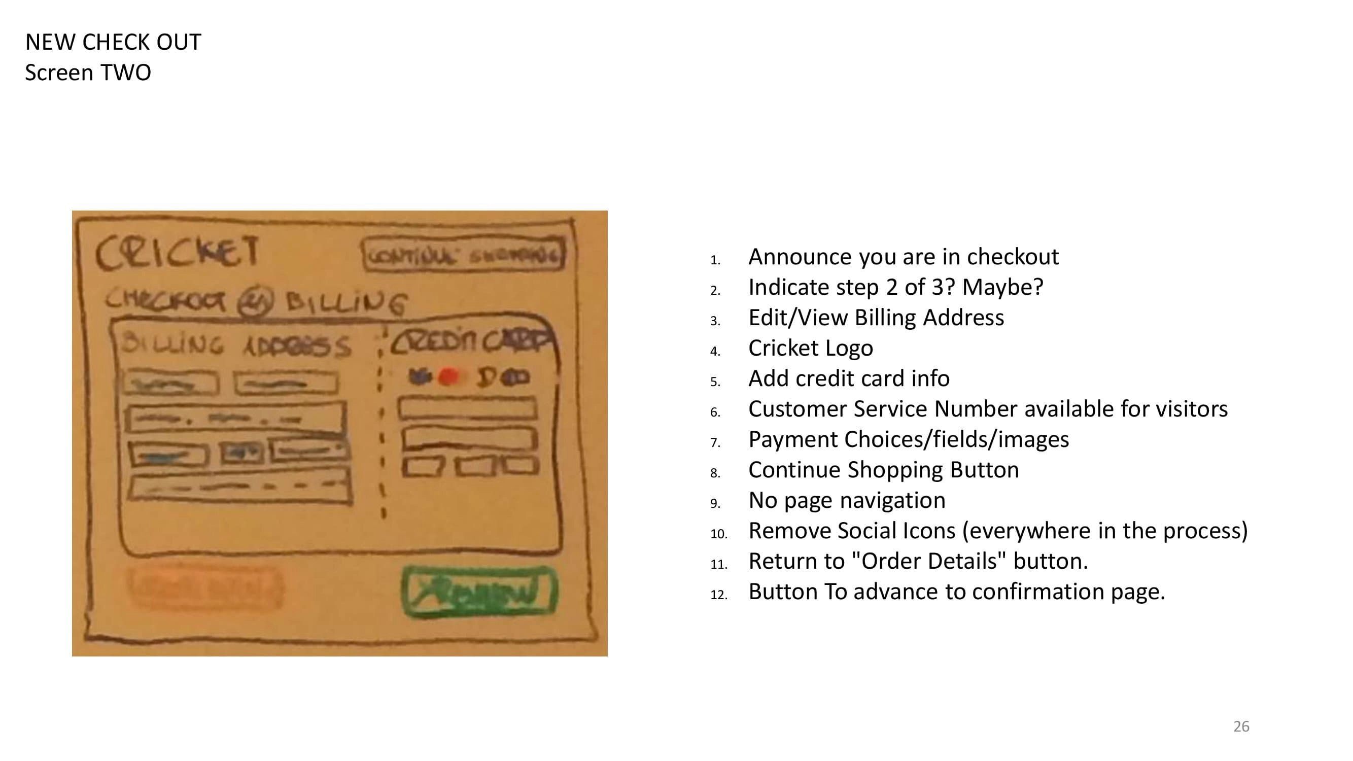
- Simplify the checkout steps to the bare minimum.
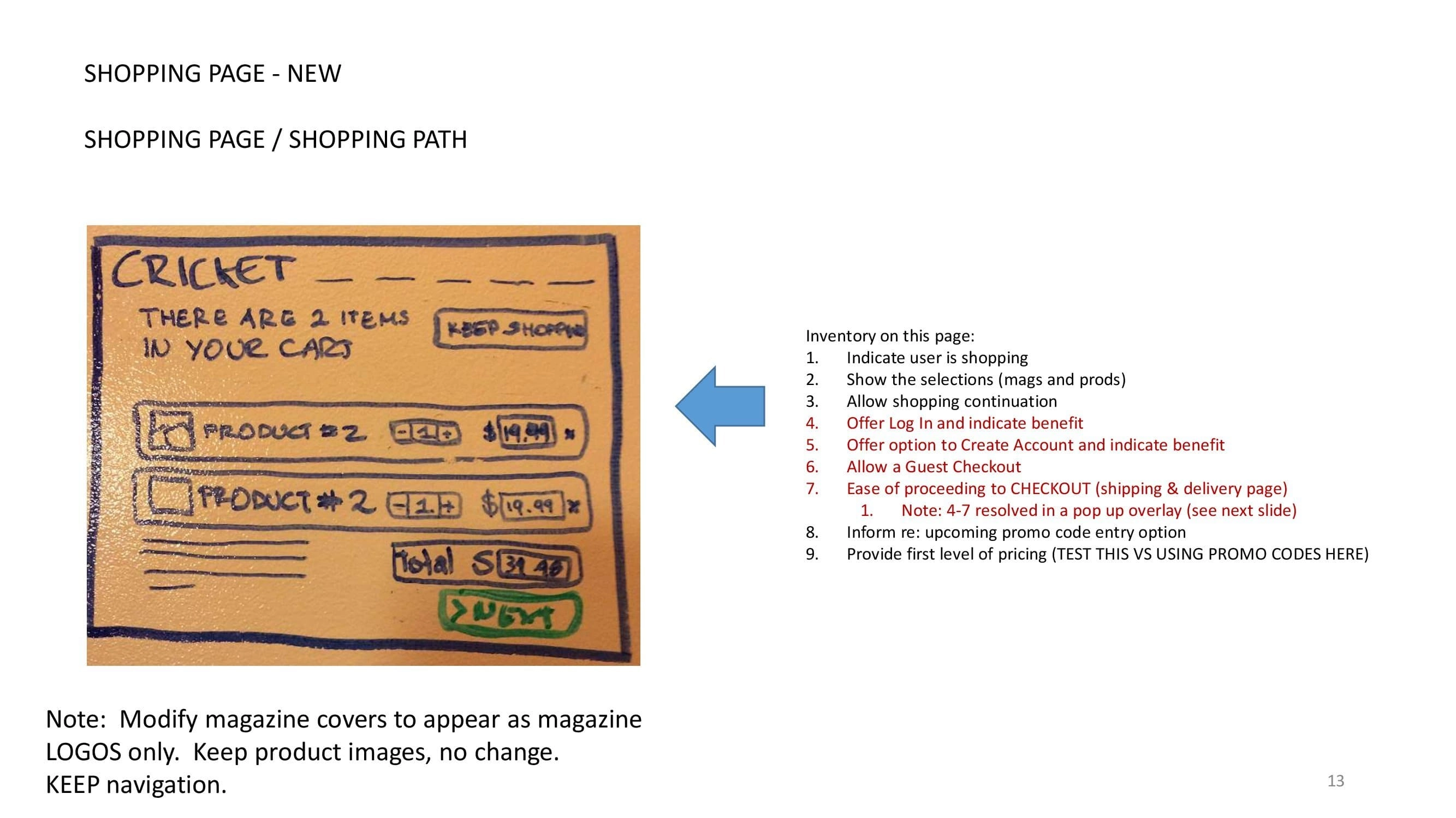
- Allow guest checkout, because a grandparent buys twice a year and an account is a tax on somebody who will never log in again.
- Increase the font size and the visibility of every UI element, which for this audience is not an accessibility nicety, it is the transaction.
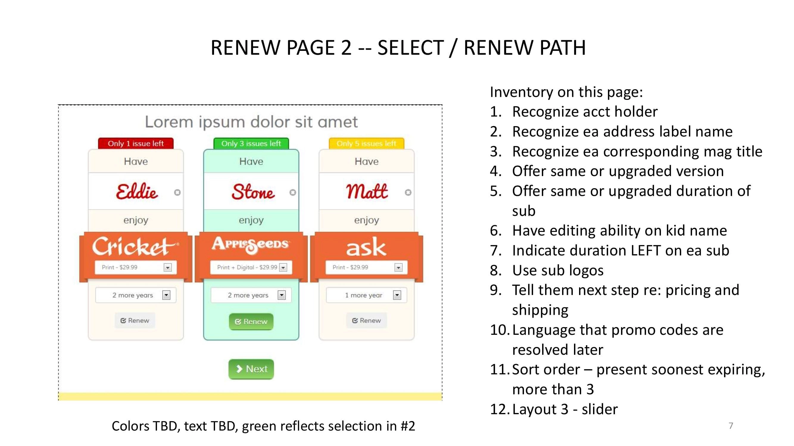
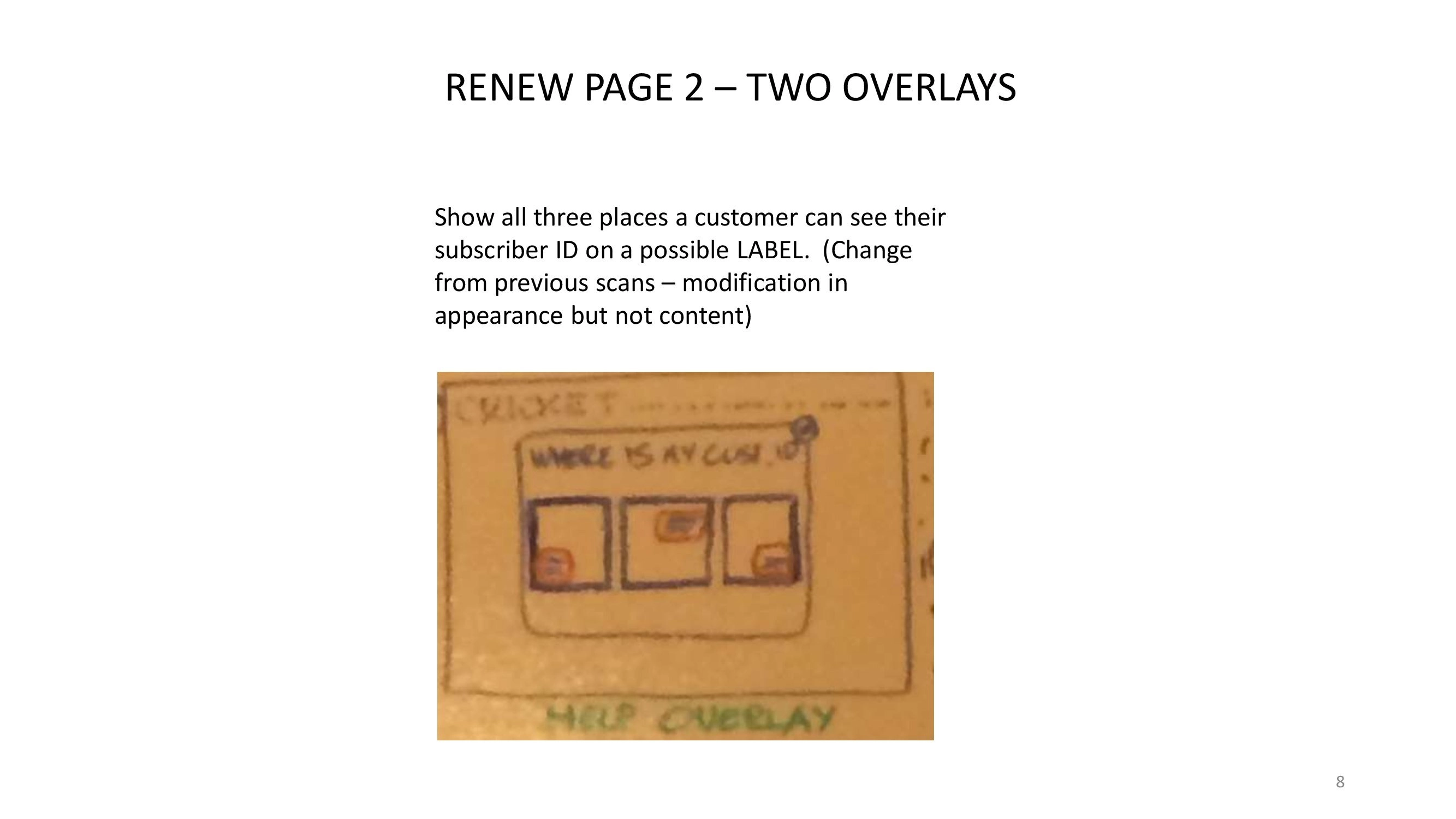
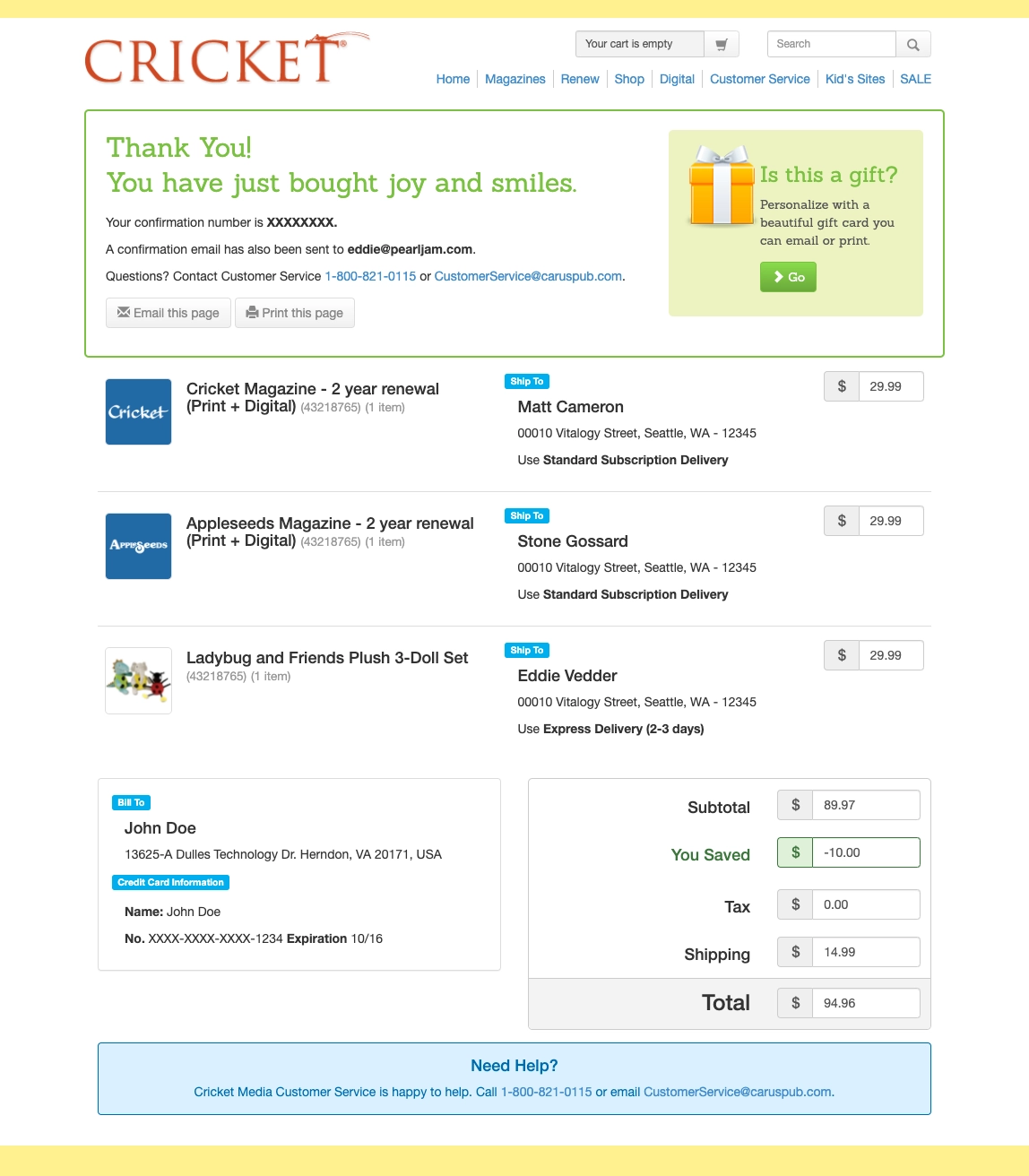
We did not throw the account away, mind you, we just moved the ask to the other side of the money. Buy first as a guest, and then, once the card has gone through and everybody is happy, a quiet "register to check out faster next time" if you feel like it. You can watch that land near the end of the flow further down.
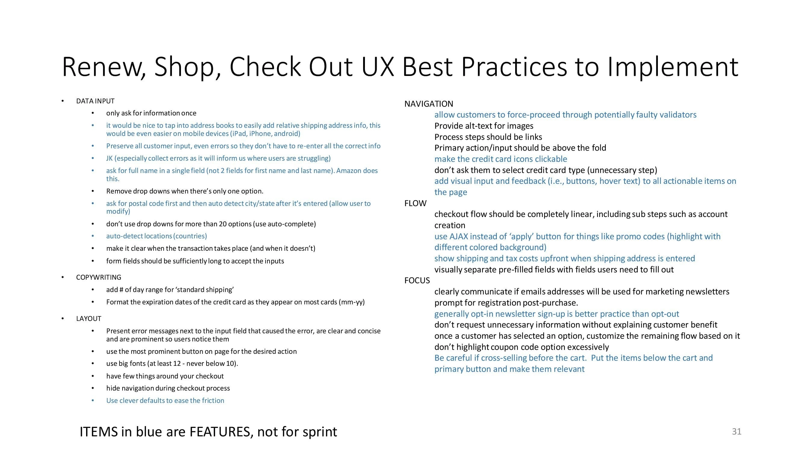
None of that is glamorous and all of it was most of the win. It cost us nothing except the humility to go look it up first. Here is the audit that came out of it, page by page:
Nobody is buying a magazine
Here is the half that no best-practices list was going to hand us. Nobody wakes up wanting a subscription to a children's magazine. A grandparent is buying a feeling, and the feeling goes roughly like this: I am investing in this child, I am the one in this family who gives books, and this kid is going to read something good because of me. That sentiment is the actual product. The paper is just how it gets delivered.
So the copywriting stopped describing the magazine and started saying that back to them. And we pulled high quality visuals out of Carus's own magazines, which was almost embarrassing in hindsight, because the art inside those pages is genuinely beautiful and it had been sitting in an archive doing absolutely nothing for the checkout. The thing that would make a grandparent feel good about the purchase was already owned, paid for, and two clicks away.
Here is the headline we shipped on the page you land on after paying. Not "your order has been processed". This:
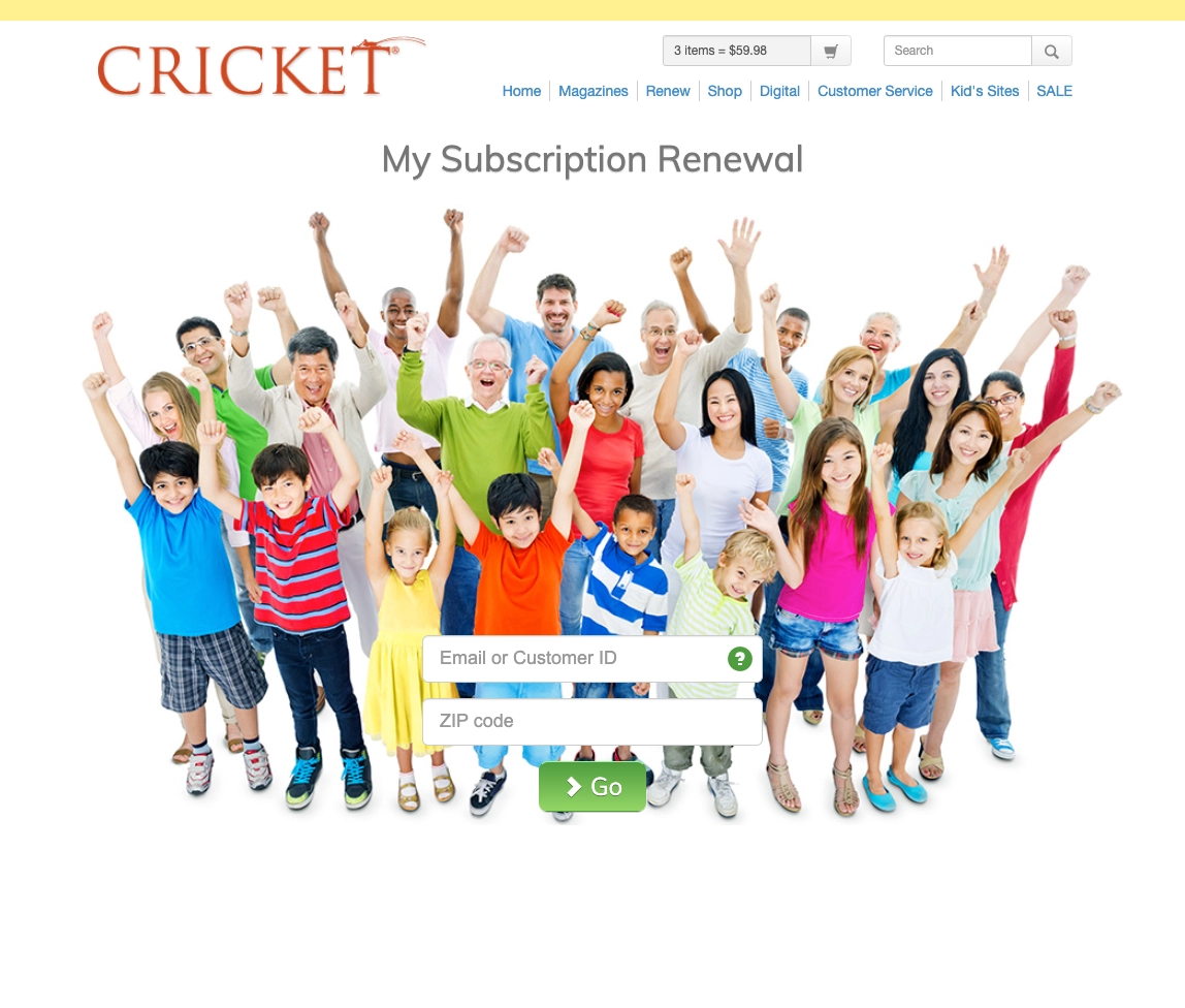

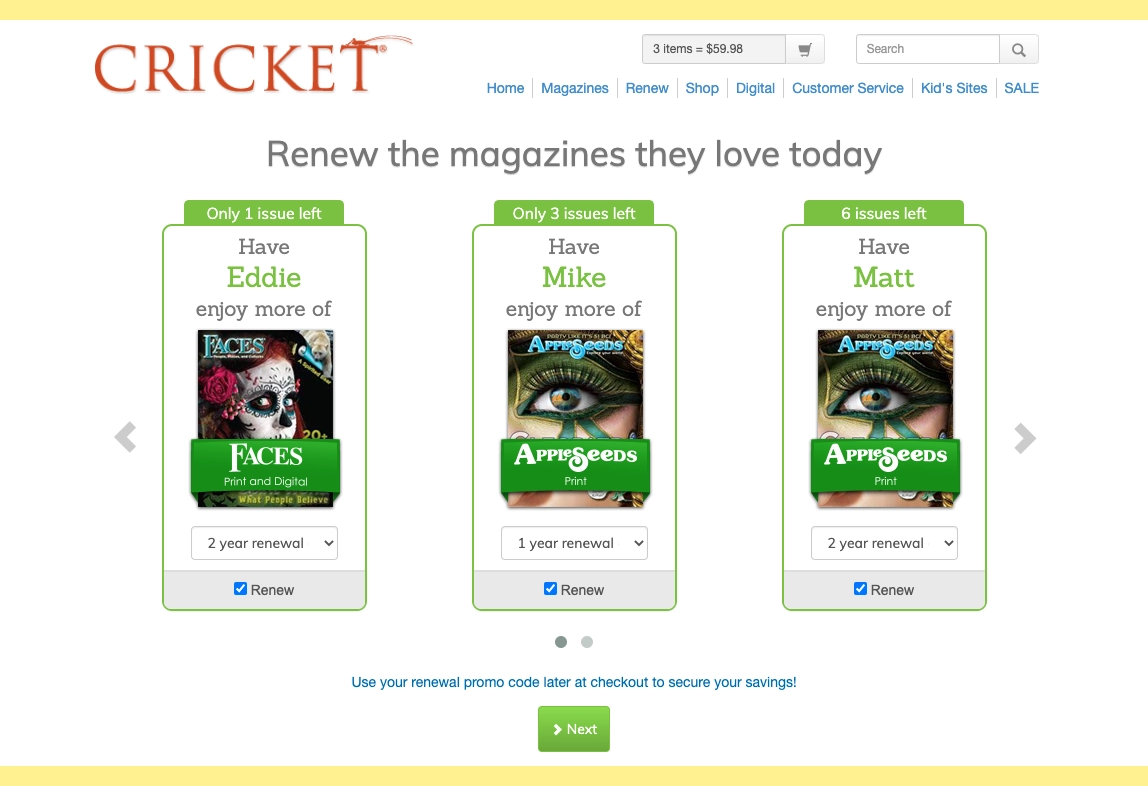

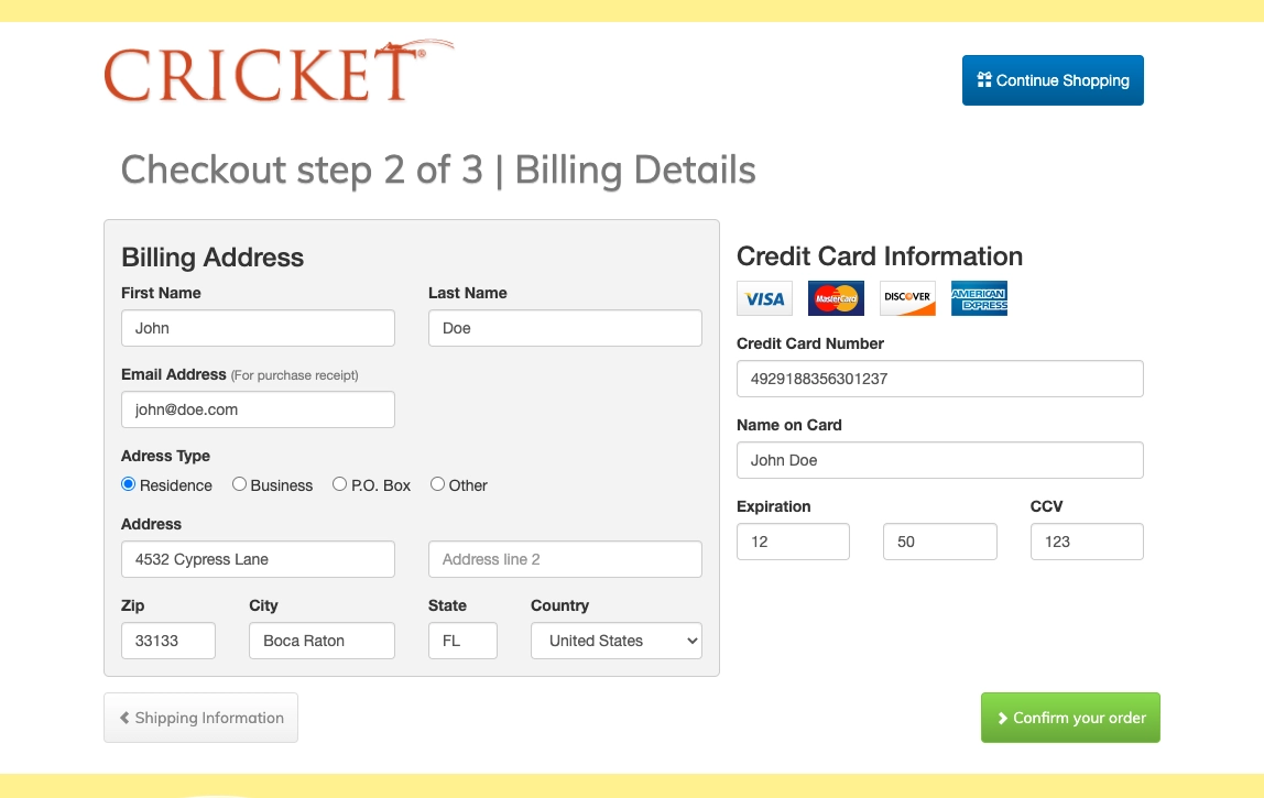
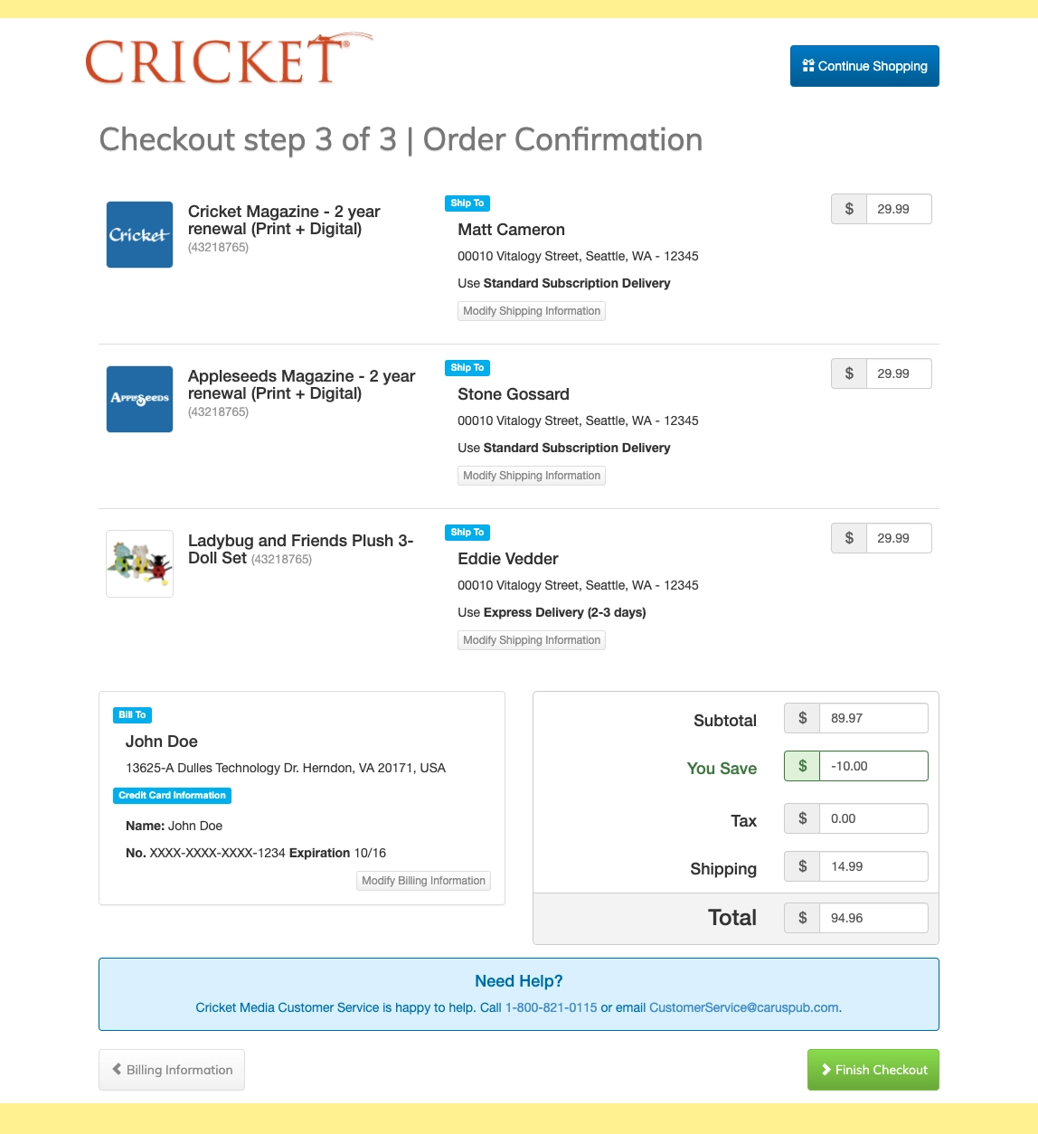
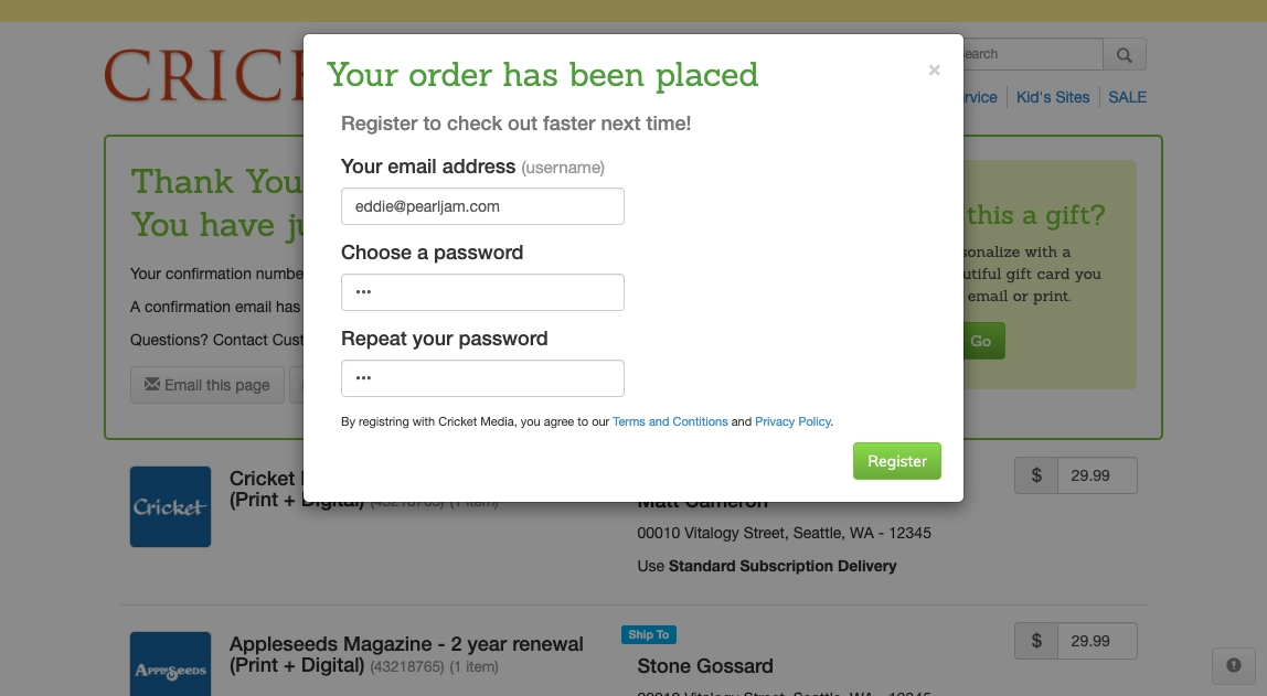
UX Flow - Happy Path
Renewals rose 25%
Post-launch data showed a 25% increase in subscription renewals, and beyond hitting the immediate goal it handed Carus something more useful: the momentum, and the confidence, to start planning a shift toward digital publications and the business that would come with it.
The lesson I carried out of 2014 is a short one, and I have used it on every e-commerce problem since. Study the user, of course, but go find out who signs. The reader and the buyer are two different people far more often than anybody admits, and when they are, every hour you spend researching the reader is an hour spent on somebody who was never going to pay you. In my experience the checkout is where that confusion finally gets caught, because that is the one screen where the person with the credit card is standing right in front of you.