Cemex Go · Racing Against Ourselves (2017 - 2022)
Cemex was running the industry's first digital transformation, so when I went looking for someone to benchmark against, there was nobody standing there. So we raced against ourselves. I took charge of the UX practice, built our own benchmark from the ground up, and turned a pile of MVPs that mistook a feature pileup for progress into one coherent product.
TL;DR
- I inherited a suite of MVPs that mistook a feature pileup for progress, disconnected from itself in both UX and architecture.
- Cemex was running the industry's first digital transformation, so there was nobody to benchmark against. We benchmarked Cemex Go against Cemex Go.
- A heuristic evaluation gave us the map, every analytics source wired into one place gave us the numbers, and cross-referencing the two meant a drop in the data pointed at a specific finding instead of a hunch.
- Behavioral data only tells you what people did, so I built the missing half: CSAT, surveys and feedback forms across the platform, plus the training to let non-researchers document users properly.
- We were dead sure the modal was right for filtering. Ten users killed it in under a second, and that is the part of this story I would read first.
- Won authority over the presentational layer, no work marked done without design sign-off, and five years of change management turned a PM-driven shop into one where UX drives the work.
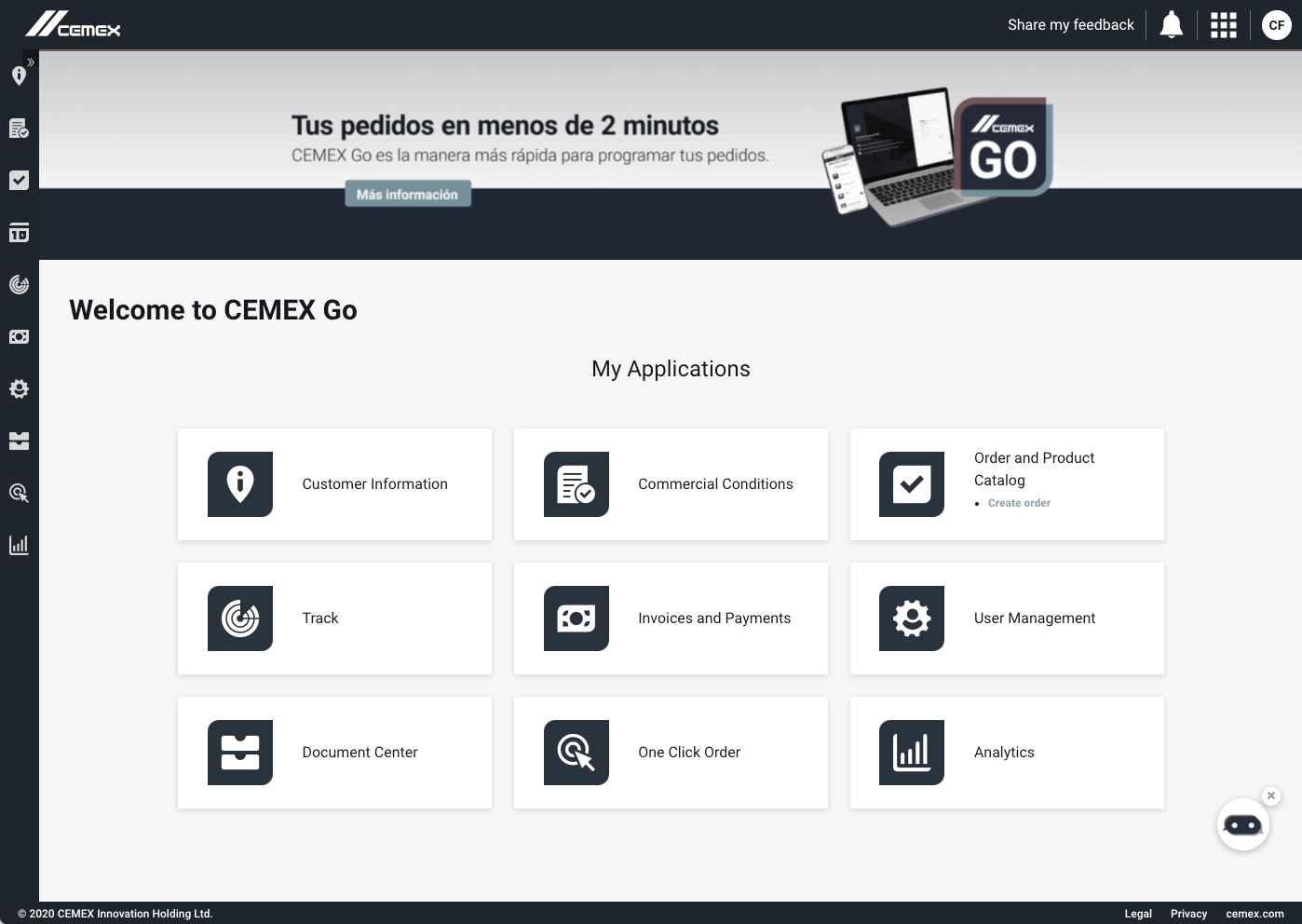
CEMEX Go is the suite of applications that sits on every touchpoint between the customer and the company, the product and the services. Order cement, track a truck, pay an invoice, watch your carbon footprint. If a customer talks to Cemex through a screen, they are talking through Cemex Go.
The mess I walked into
The mandate was not small. Put the whole customer interaction online, give customers real visibility into an industrial process that used to happen behind a wall, hand them every document and asset the moment an exchange produced it, and bring the overall cost of all that down. Four goals that read tidy on a slide and fight each other the moment you try to build them together.
I took charge of our UX and Product Design practice, and technically leading it meant owning both the craft and the mess. And oh, what a mess it was. Projects had been rushed to MVP and left there, the creation driven by feature pileup, which is a polite way of saying subpar UX, and what came out the other end was a suite disconnected from itself in UX and in architecture, with no process anywhere to drive a decision with data, and a UI development layer that quietly undid the design on the way to the screen. None of those is fatal on its own. Together they compound, and every new feature poured onto that foundation only widened the crack.
The team
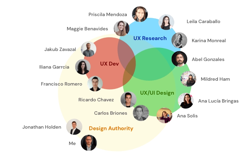
This is the group that carried it.
We benchmarked Cemex Go against Cemex Go
Here is the strange part of being first. Cemex was the pioneer of digital transformation in the industry, which sounds great right up until you go looking for someone to measure against and find nobody standing there. No competitor to copy, no benchmark to buy, no chart telling you where you ought to be. So we raced against ourselves, and our own last quarter became the competitor.
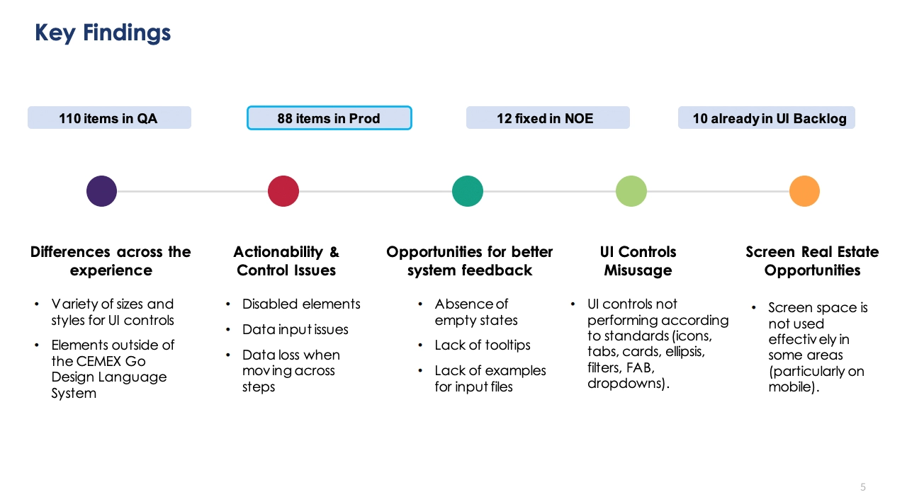
You do not fix five problems with one heroic sprint, you fix them with a cycle you run over and over until the product stops fighting you. So before touching a single screen we started where you always should, with a heuristic evaluation across the entire suite, every screen and every flow judged against the same rules so the findings could be compared instead of argued. Each finding got categorized by severity, by how hard it would be to resolve, and by the action it called for, then it went to stakeholders, product management and development to pick up an extra layer of insight before it became work, and from there it turned into epics and stories that ran through JIRA, where the whole product team saw the same list and followed the same path to close it.
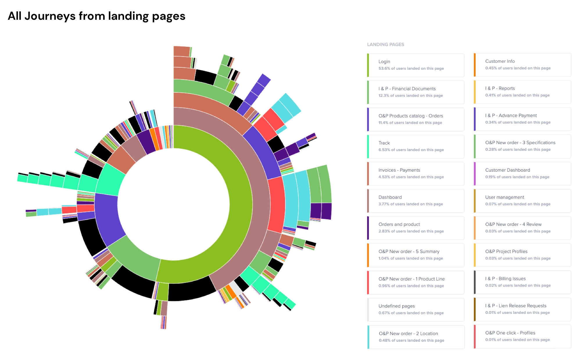
That gave us the map. The numbers came from connecting every analytics source scattered across the teams into one place, Google Tag Manager, Google Analytics and Contentsquare, and building reports we could actually read, which is how we got our hypotheses on abandonment, on conversion gaps, and on the features that were either overused or ignored. Then the part that made it all worth something: we cross-referenced those numbers against the heuristic evaluation, so a drop in the data pointed at a specific UX finding instead of a hunch, and it all fed back into the stories and epics, with new ones written wherever the data demanded them.
If it can't be measured, it doesn't exist
Behavioral data tells you what people did. It says nothing about how they felt doing it, and that whole half was simply missing. Attitudinal metrics were not being collected at all, and the customer conversations that Project Managers ran on the side went undocumented, so our source of truth was a pile of loose comments and opinions. Not good enough.
So we diversified the channels we collected from, set real standards for elicitation and for writing it down, and dropped CSAT questionnaires, binary thumbs up and down surveys and open feedback forms all across the platform, with dashboards behind them so the information could actually be seen instead of just stored. The piece I am proudest of is the least glamorous one: we built the tools and trained the non-researchers, so a PM could go run and document an interaction properly instead of bringing us an anecdote. It did not take long for everyone to see the value of UX and Product Design talking straight to users. What felt radical then is just how the work gets done now.
The designs arrived looking like a distant cousin
We kept shipping designs that reached the screen looking like a distant cousin of what we drew. The front-end developers were not translating intent well, and every small miss added up to a UI that quietly dented the whole experience.
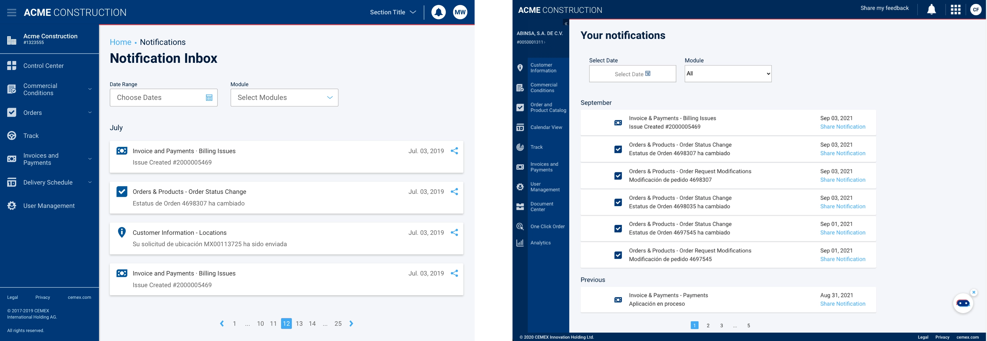
So we closed the gap from both sides. We retrofitted the latest spec of our Design System into the applications, took an inventory of the interactions that repeat across the suite, and defined interaction systems and patterns to cover each group in that inventory.
Ten users and one very dead modal
That inventory is also where we got humbled, and it is the story I would tell first if you asked me what those five years actually taught me.
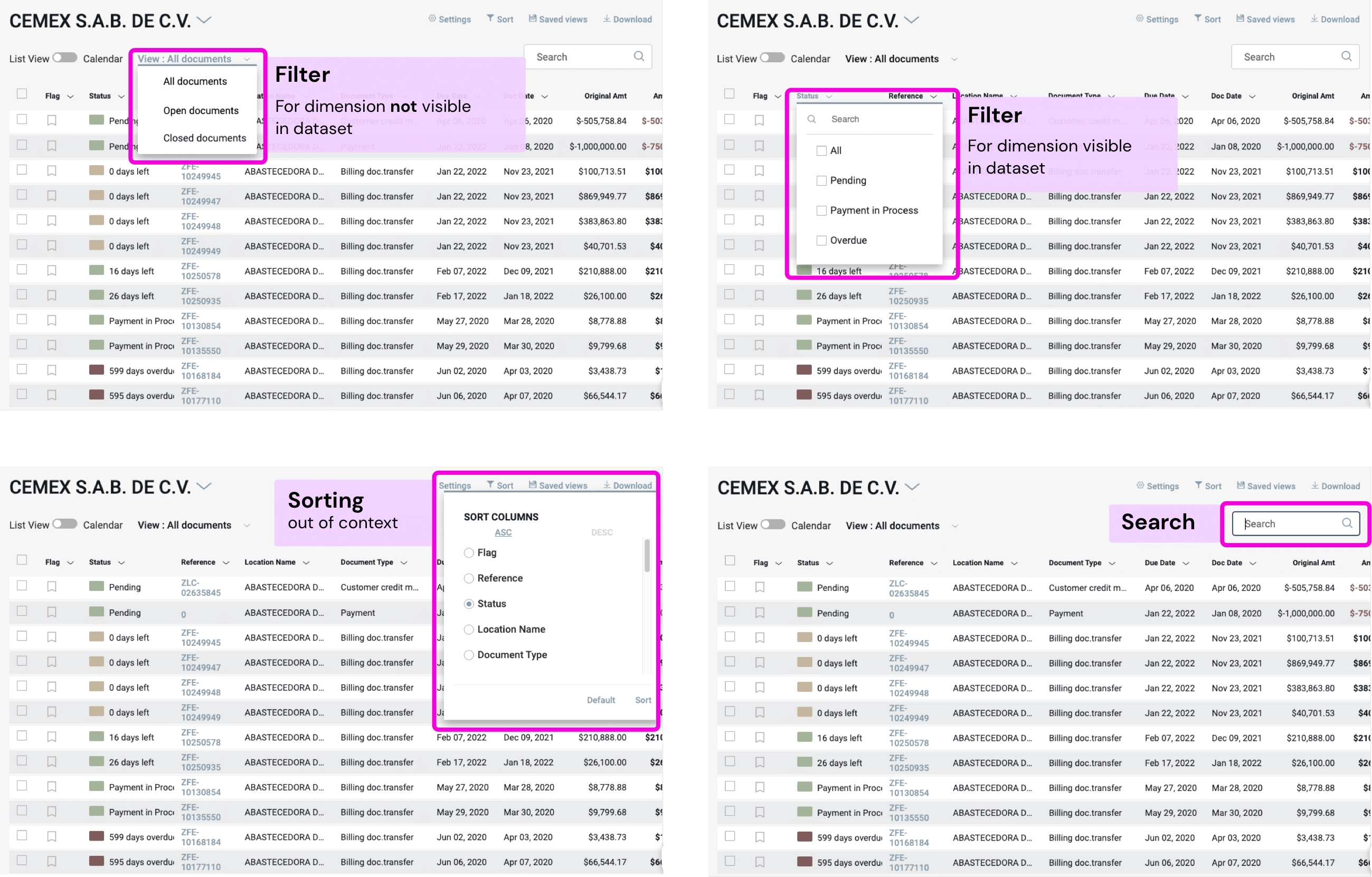
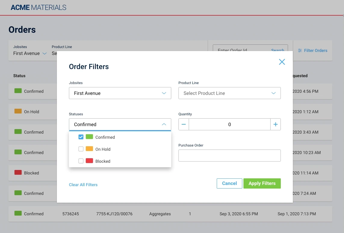
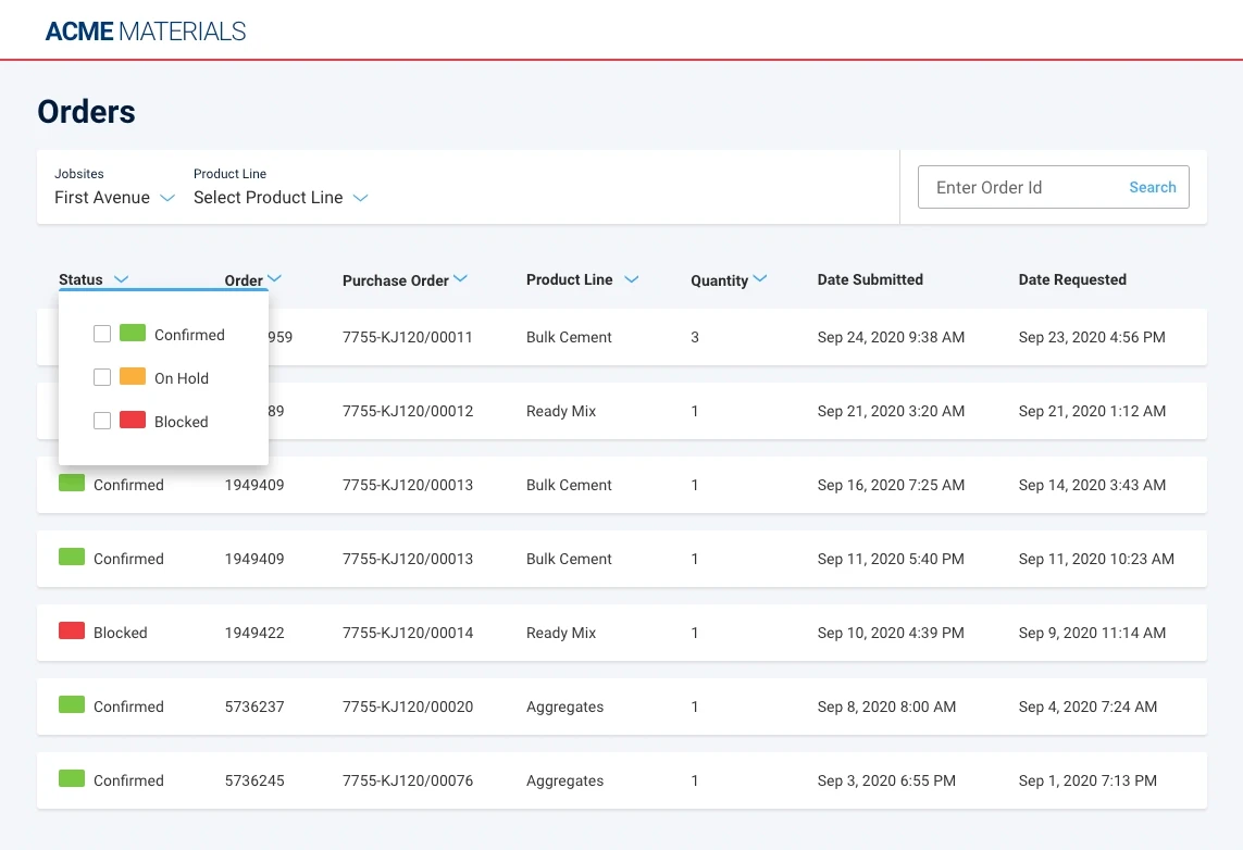
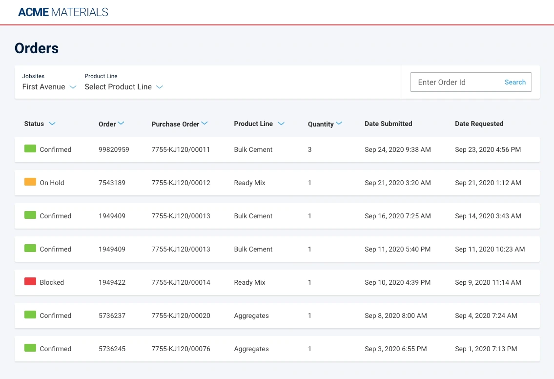
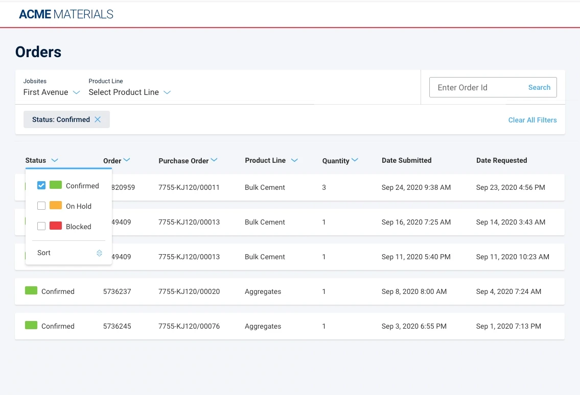
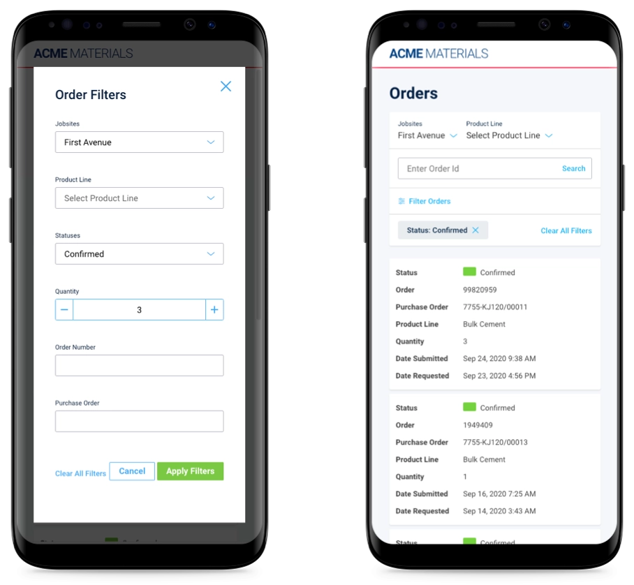
Filtering data was everywhere in the suite, so it was the obvious place to start, and we were dead sure the modal was the right call. Not hopeful. Dead sure. Everybody uses that pattern, it keeps the controls out of the way until you want them, and we had good reasons lined up behind it. Then we put prototypes in front of ten users from our actual target audience, modals against filters living up in the headings, and they proved us wrong in under a second. Not after a careful debate. Under a second.
Do I enjoy being wrong in front of my own team? No. But that is the entire reason the process exists, because finding out cost us five minutes and a prototype, while finding out after we had rolled that pattern across the whole suite would have cost us a year of undoing it. I wrote the full story up in Overconfidence vs. User Testing.
Owning the presentational layer
Paying down UI technical debt is still ongoing, and it always will be, because a living product never stops accruing it. What changed is the leverage. Our team got its own UX Development team that answers to exactly these concerns, and we were handed the authority to block work from being marked done until the responsible designer, or the Design Authority, had signed off. That single gate moved the ownership of UX, UI and flow squarely onto our team, and funny thing, once developers knew the door was there, they built the UI with a lot more care on the way to it.
A few before and afters
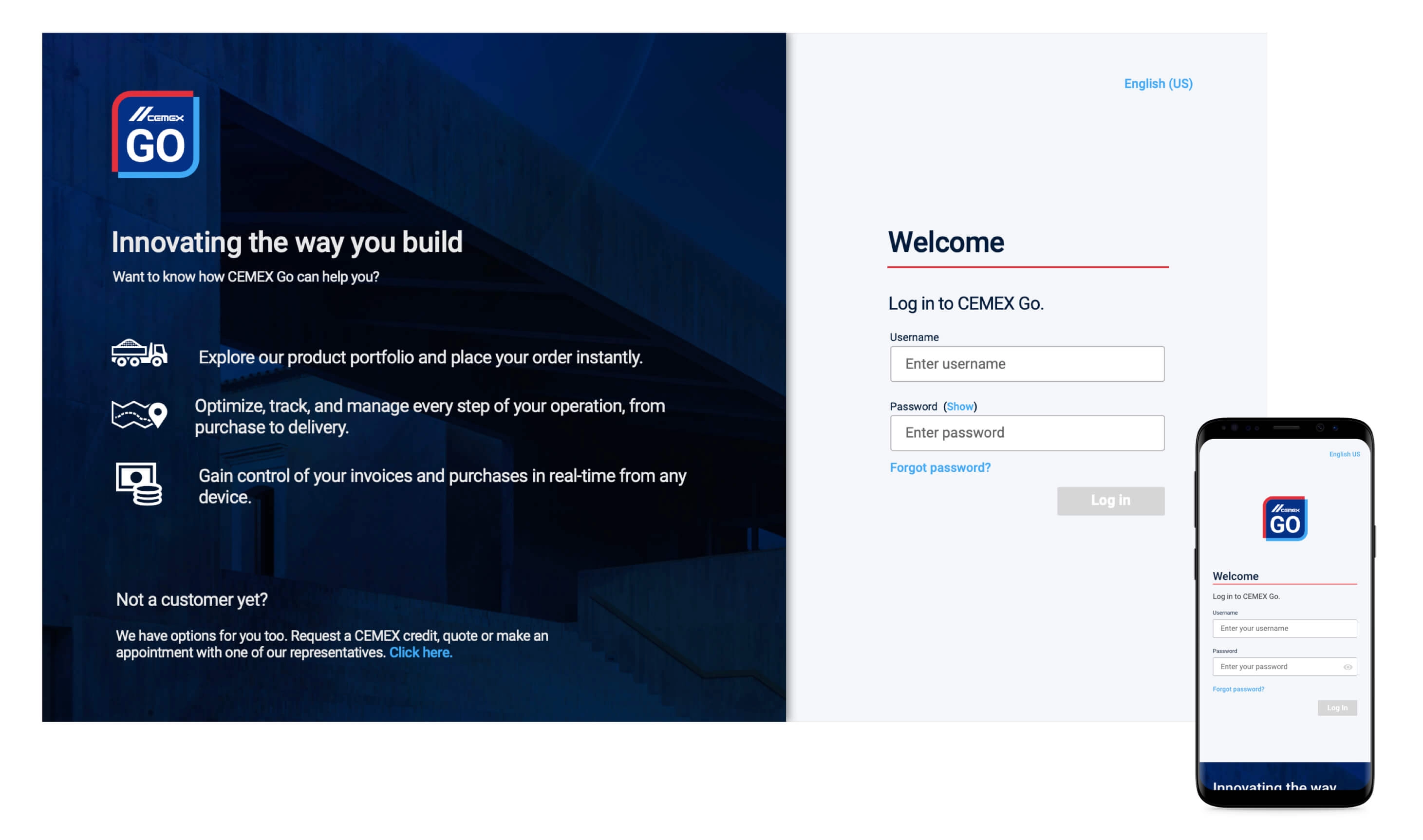
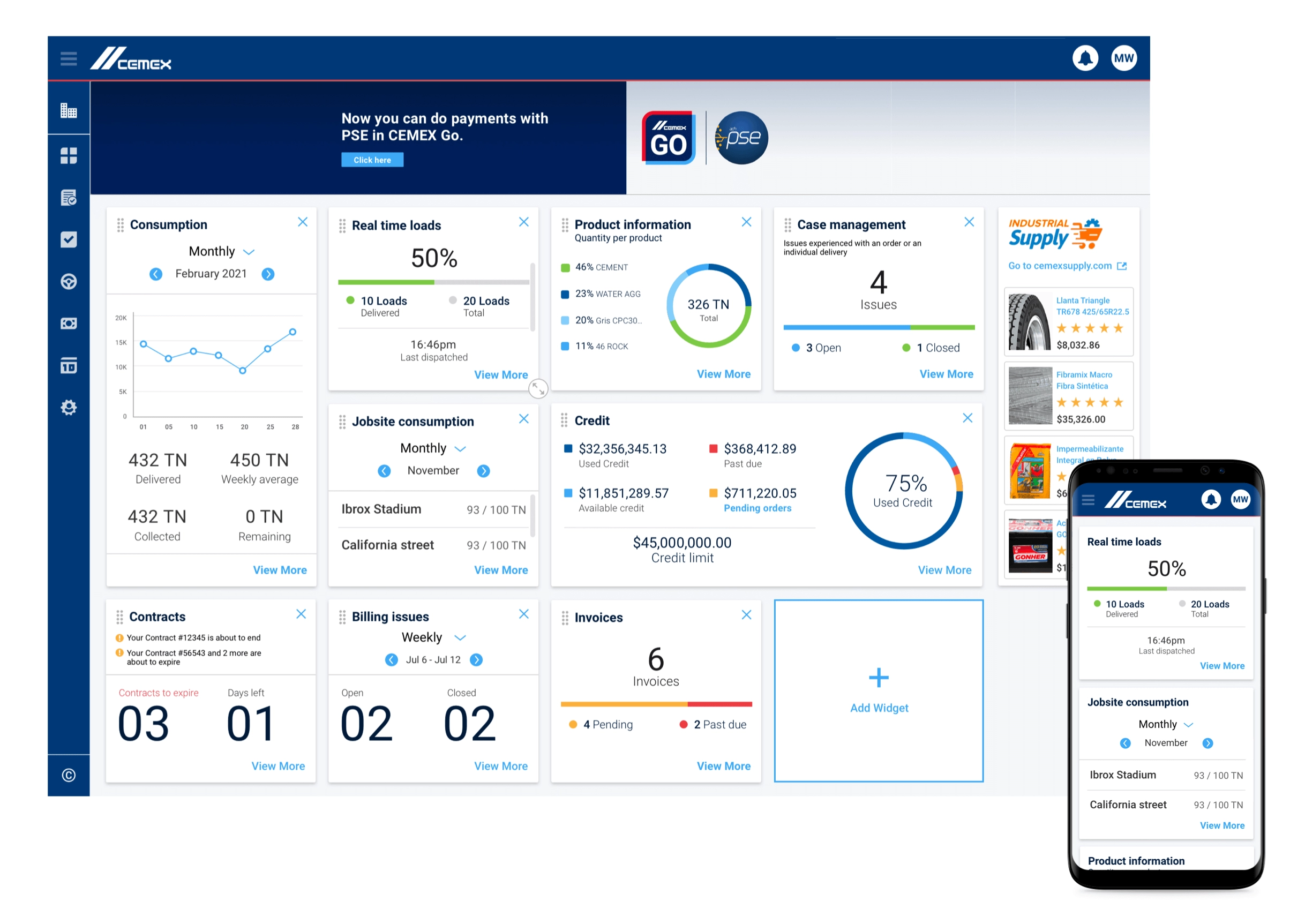
With the processes in place and a real understanding of what users needed, we could finally aim. The perception of quality rose across the board, and we could put the focus where it earned its keep.
The graduation
Cemex spent five years turning from a shop where the PM drove everything into one where User Experience Design sits front and center, and the payoff showed up first as quality, then as a real jump in conversions once the UX process was the thing steering the creative work.
Five years and a mountain of change management later, the company has a healthy read on its relationship with customers, for today and for whatever comes next. That, in my experience, is the only kind of transformation that sticks: the slow kind.