How to Redesign When You Have No Data

TL;DR
- A BigCommerce trial funnel was converting at a rate low enough to alarm leadership, and nothing was instrumented to explain why.
- With no data to lean on, I aimed with usability heuristics: the platform was too complex for first-time "dreamer" merchants.
- The old checklist had four items and the flow we shipped has four sections, so nothing got shorter. The old four were a lie, hiding twelve or fifteen substeps loose in the control panel.
- So I guided instead of cutting: tax answered from where they live, payments narrowed to one obvious call, branding and domain pulled up into the flow instead of buried in settings. Exactly one step got thrown out.
- I designed and built the React prototype myself, which ended the look-and-behavior debates and handed engineering the real hard part: the data.
- Then I instrumented it and let the numbers drive. The surprise: merchants don't care about look and feel yet, they want a live store taking transactions.
- Conversion to paid accounts tripled at launch. Heuristics got us to the starting line, but once the data showed up it ran every turn after that.
Only a small slice of the people who signed up for a BigCommerce trial ever went on to become paying customers. Not a healthy number, and leadership knew it was alarming, but nobody could actually tell you why it was happening, because nothing in the flow was instrumented well enough to say.
And that is really what this piece is about, a situation far more common than it should be. You inherit a funnel that is clearly broken, you have a strong hunch about why, and you have nothing in the way of data to back the hunch up. The safe instinct is to wait it out: instrument everything, gather a few months of sessions, and then decide. But sometimes you cannot afford that wait, and honestly you should not. Here is how I moved anyway.
Heuristics are how you aim before you can measure
On the product design team we had been saying for a long time that onboarding was underwhelming. We could feel it, not from any dashboard but from running the flow against a basic usability lens, where the gaps are honestly hard to miss. The problem never got the priority it deserved until someone in senior leadership finally saw the same thing we did, and that was the opening we had been waiting for.
When you have nothing to measure, heuristics are a wonderful place to start, and the Nielsen Norman set is short enough that you will actually use it. Applied here, my read was pretty plain: BigCommerce is a powerful and genuinely complex platform, its control panel has no clean information architecture for a newcomer, and the people signing up are mostly dreamers who have never run a store and have no earthly idea what setting one up really involves. So the target picked itself. Make it feel as easy as selling on eBay or Etsy, because that is a promise a dreamer understands instantly.
First, just get them to a live store
So I split the work in two. The first half was a handholding flow whose only job was to walk a merchant to a live, transacting store as fast as humanly possible.
And here is the part that surprises people. The old setup checklist had four items on it: add products, set up to ship, configure payments, set up your tax rates. The flow we shipped also has four sections. Four became four, nothing got shorter, and that is exactly the point, because those original four were a lie. Every one of them opened onto a pile of substeps buried somewhere in the control panel, and there were probably twelve or fifteen of them back there, so a merchant would tick a box believing they were a quarter of the way home and find out the box was a trapdoor. Four cheerful checkboxes that did not reflect one bit of what you actually had to do. That is not a checklist. That is a way to lose people.
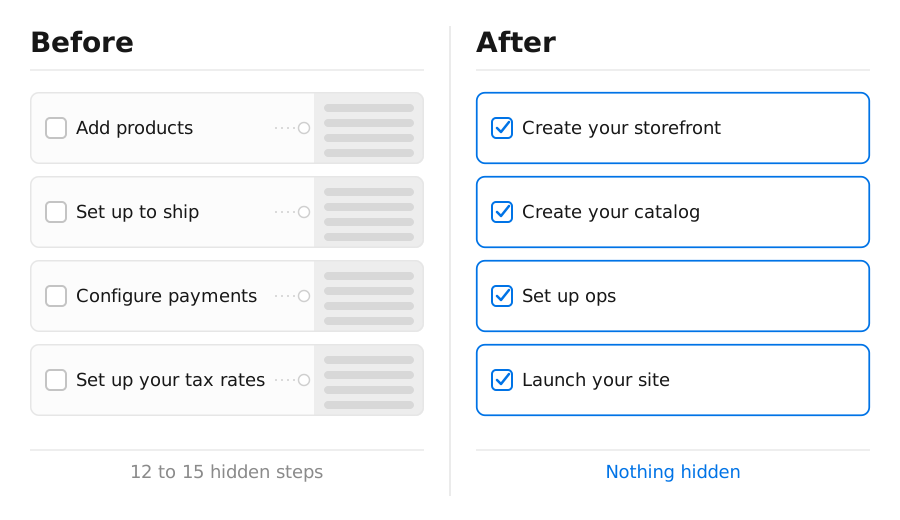
So I never went looking for things to delete. I made the four steps tell the truth, create your storefront, create your catalog, set up ops, launch your site, and then took every one of the substeps that had been hiding underneath and asked the same three questions of it. Can I answer this for them? Can I narrow it down to a single obvious call? Or can I at least drag it up into the flow where they can see it? Almost everything had an answer in there somewhere.
The brick wall in all of this was tax, and oh, what a wall it is. Getting reliable tax data out of a reputable source is genuinely hard, and the United States is the biggest headache of all, with rates that vary by jurisdiction in a way most of the world simply does not deal with. Avalara publishes that data, so we used it to auto-configure US taxes straight from the merchant's location, and everywhere else in the world is close enough to a flat VAT that a much simpler rule does the job. All the merchant had to do was tell us where they were, and just like that, tax quietly stopped being a wall.
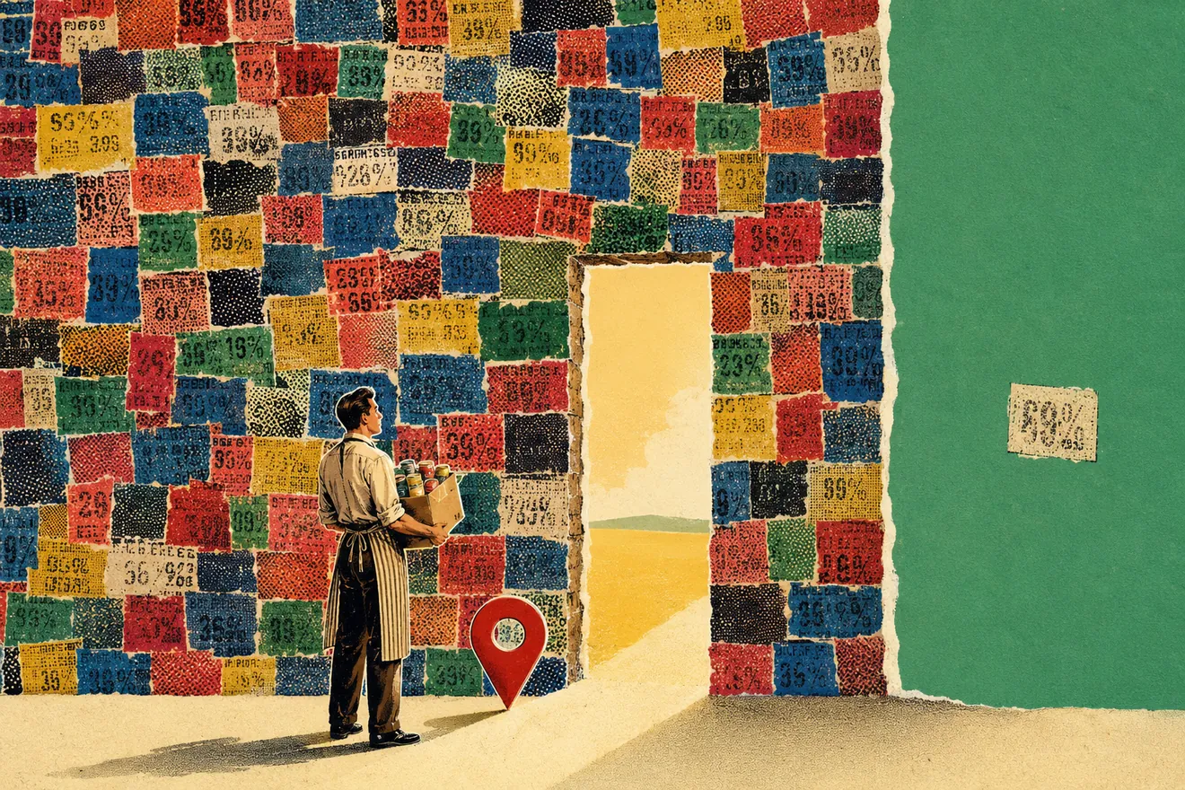
Payments were the opposite problem, because that wall does not move. A gateway has to check that you are a law abiding citizen before it will let you take money from anybody, and no amount of design makes that requirement go away. What I could take away was not the step, it was the choice. The old flow dropped a first-timer into the payment settings page and let them drown in a plethora of gateways, every one of them a decision that a person on day one has no business making. The new flow hands them one option that works, and a second one for diversified merchants, the people selling the kind of goods most gateways will not touch. Which of the two you are shown was already settled by the questions you answered at signup, so it never becomes something you have to go and research. The regulatory wall is still standing exactly where it always was. They just never meet it as a decision.
Shipping got the same treatment. A dreamer is not thinking about carriers and delivery zones on day one, so we did not make them. We set them up with free shipping and a plain-language nudge to remember to build the shipping cost into their price, and we turned on auto-fulfillment with another nudge to remember to actually go post the packages. They are small, honest defaults, but they keep someone moving forward instead of stalling out on a decision they are in no position to make yet.
The rest of it was mostly a question of geography. The logo used to mean a trip out to a settings page, so we brought it into the flow. The theme still gets a default we know works, exactly as it always did, but now you can pick one right there without going anywhere, out of a list we narrowed down to the free themes that are genuinely full featured. The catalog had no guidance whatsoever, so we started asking at signup and matching people to the path that fits them, whether that is importing, migrating off another platform, or building a first product by hand. And adding a domain, which used to be an archaeological dig through the control panel, is now two links sitting patiently in front of you.
Exactly one thing got thrown out. There was a step that made you test your site before launching, which sounds responsible right up until you notice that a merchant who had done careful, thorough work still had to perform the ritual before anyone would let them through. So it became a note, a gentle you may want to give this a proper test, and people got to launch. One step removed out of all of that. Everything else, we escorted.
Build the front end yourself and the arguing stops
I designed the flow and then went ahead and built the prototype myself, in React on top of our BigDesign system, running on mock data and mock services. That matters a lot more than it sounds like it should.
A working front-end prototype quietly ends the eternal debate about how the artifact should look and behave, because people stop arguing over a static frame the moment they can react to the real thing in front of them, and oh boy, does that save everyone a mountain of grief. It also draws a nice clean line for engineering: the hard part of the job is retrieving and storing the real data, not figuring out how the interface is going to consume it, and the prototype hands that whole question over already answered.
Now instrument it, and get out of the way
Once handholding had launched and proved out the direction, we could finally measure things properly. The metric we put at the center was a simple one: how long does it actually take to reach a transacting store, and where along the way do people fall off.
And then the data told us something none of us expected. We had gone to real trouble over branding, dragging the logo and the theme picker up out of the settings pages and setting them down right there in the flow where nobody would have to go hunting, and merchants walked straight past the whole thing. At this stage of their journey they genuinely do not care about look and feel, because the only thing they really want is to watch the store come alive and start taking transactions. That one finding quietly reorders your entire backlog, and I will be honest, I would not have believed it half as strongly if I had not watched it happen with my own eyes. We handheld them through a step they did not want to be handheld through.
The result
Conversion to paid accounts tripled the moment the handholding flow launched. The redesigned onboarding is live today, and we are still working our way through the pain points the data keeps surfacing, because that kind of work never really ends. The exact conversion figures are internal to BigCommerce, but I am always happy to walk through the shape of them in a conversation.
So, when does this stop working?
Here is the catch, because there is always a catch. This whole approach has an expiry date, and knowing when it expires is really the entire point of it. Heuristics are a cold-start tool. They tell you where to aim when you have absolutely nothing else to go on, and they are remarkably good at exactly that. But the moment real data shows up, you have to be willing to let go of them and follow the numbers the rest of the way. Your judgment is what picks the starting direction, and from there the data is what should be picking every turn after it. If you keep trusting your gut once the dashboard is live, all you are really doing is guessing with a little extra confidence.
So the next time someone hands you a broken funnel and no data to go with it, do not sit around waiting for a chart that does not exist yet. Aim with your heuristics, ship the version that treats a nervous first-time user kindly, and then let the data tell you what to keep and what to throw away. That, in my experience, is how a number that stubborn finally starts to move.