Overconfidence vs. User Testing

TL;DR
- As designers we optimize: fewest elements, most problems solved. A good instinct, until it hardens into overconfidence.
- We replaced table-header filters with a modal flow because it unified desktop and mobile. Cleaner on paper.
- A PM pushed back and wanted header filtering. Instead of arguing, we built both as real prototypes and put them in front of users.
- Ten construction pros, 40 to 55 years old. They reached for the table headers in under a second. Excel had trained them, so the headers felt native.
- Header filtering cost more to build. The sessions made the decision obvious. Nothing beats user testing, and humility is part of the job.
As designers we sometimes slip into the engineering mindset of solving the most problems with the fewest elements. That is not a bad practice. You take in all the requirements, come up with a UI that satisfies the acceptance criteria, account for the time it will take to build, and do your best to meet the customer's expectations. If that sounds complicated, it is. Balancing all of those factors is never easy breezy.
This is a story about compromising for the sake of efficiency, and then letting your judge, the user, have the last word.
Standardization and normalization
The case in question was a page with a large dataset displayed as a table. When we first met this page, we spotted several flaws in its responsive behavior. The data filters lived in the table headings, and of course, on mobile, there were no headings left to attach them to, so the filters had to move into modals. The implementation was not executed brilliantly, so it caused more confusion than it solved.
That triggered an exercise to design a system that could adapt to these situations. We got rid of heading-based filtering and moved to a modal-based flow, the kind you see everywhere now. With that, the desktop and mobile artifacts would work the same way.
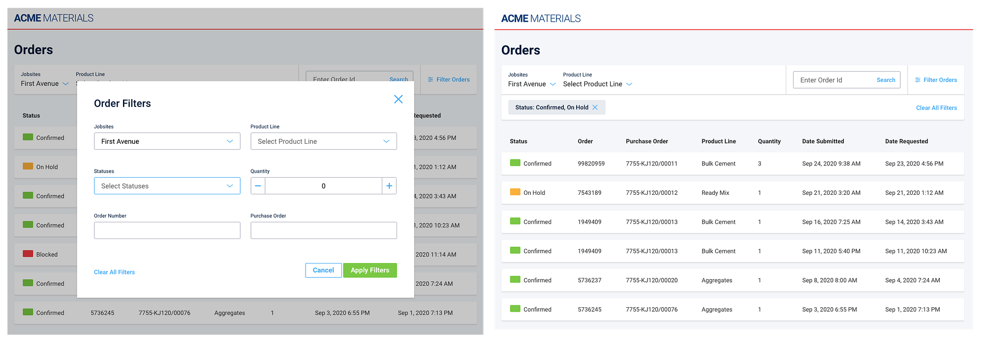
We anticipated this would carry an initial learning curve for some users, but we were confident they could get through it without much hassle.
That one product manager
We started rolling the change across all the filters in the product. One day, mid-process, a product manager asked us to implement heading-based filtering in a new feature. We explained the issues it carried, backed by our evaluation, product benchmarks, and the list of benefits the modal approach gave us. He insisted, fiercely, that heading filtering was the right way, because he knew the customers better, and all of the other things I am sure you have heard at some point.
This kind of thing has to be handled well for the sake of a healthy work environment. Since it is a common occurrence on product teams, we already had a way to settle it: go straight to the customers and run user testing on the artifacts in question.
So we built actual software prototypes of both implementations, one with modal filtering and one with heading filtering.
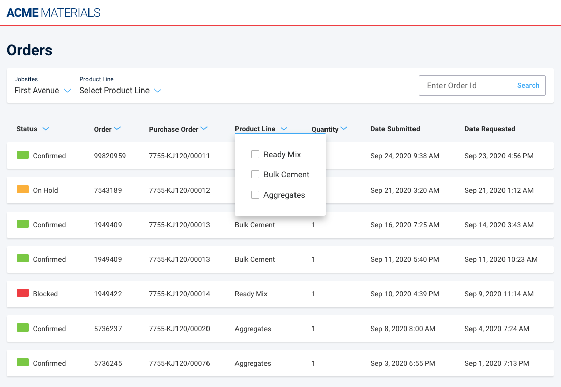
We also fixed the flaws that had triggered the whole change in the first place, so the heading filters were ready to meet every requirement. Everybody was on board with the prototypes, and we narrowed the test to desktop only, since it was understood that both mobile versions would use the modal variation.
A day in court with a jury of your own users
This is a humbling moment, especially when you get to watch users move through a piece of UI you came up with.
Around ten users took the time to do this, all within our target audience: construction professionals between 40 and 55 years old. They were shown the modal artifact first. Despite some friction, they managed to filter, exactly as we had expected when we first made the change. Then they were shown the heading treatment, and oh boy, they liked it. It was incredible to watch them get magnetically drawn to the table headers, clicking and filtering in less than a second.
Asked for their preference at the end, they all chose the heading treatment. Many said both were good, but since their daily software life revolved around Microsoft Excel, filtering through headings felt more natural. We recorded the sessions. Watching a target user reach for the headers on instinct is worth more than any argument in a meeting.
Lessons learned
Not much to say, really. We gathered the results of the test and streamlined the heading treatment so it could do everything we needed our customers to do. After all my years of experience, nothing beats user testing to determine whether what you are doing is the right way to move forward.
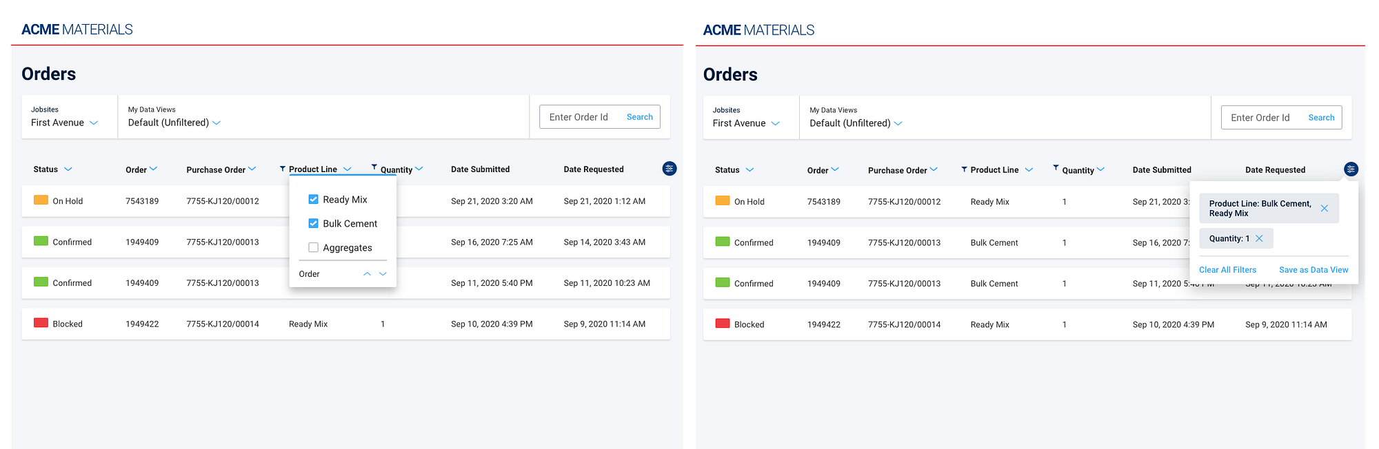
Heading filtering was more time consuming to build than the modal version, so the company had to decide whether it was worth the time and money. After watching the videos, it was pretty evident that it was.
Last but not least, humility is essential to being a great UX professional. Our craft carries an intrinsic level of arrogance. We signed up to define how people should behave around the things we make, and that alone takes high self-esteem. But it also asks you to stay open to the ways others use what you build. That does not undo what you learned in the past. It is simply a lesson for what you will make next.